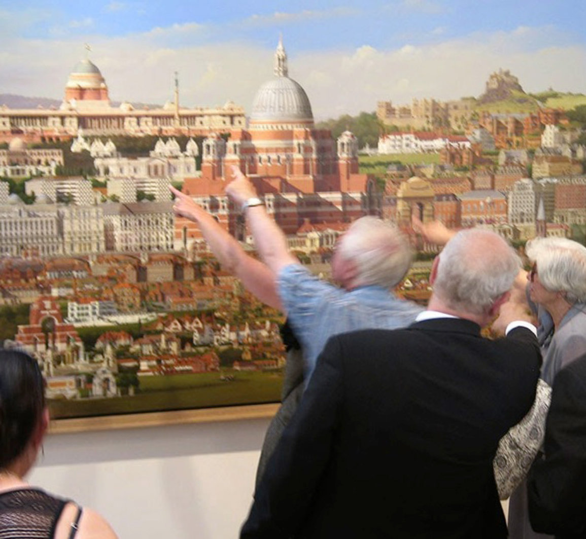
1st March, 2013
Recently I sent the Driehaus capriccio, A Classical Perspective, to Notre Dame, the end of more than a year’s work (see projects) Now it is time to start seriously on a Lutyens capriccio.
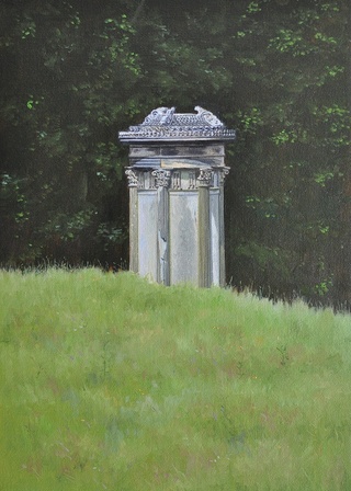
The Choregic Monument, symbol of the Driehaus Prize, as reconstructed at Shugborough
This idea began when we stopped at Castle Drogo to break the journey home from St.Ives nearly two years ago. I have visited a number of Lutyens buildings since then, but hardly seem to have made a dent in his massive body of work. There have been mixed results in visiting properties. It is often difficult to work out whom to contact in advance to arrange to visit a private house, so I was frequently left with no option other than to turn up and hope for the best. Some people have been wonderfully helpful and generous with their time in showing me around their properties, others have been understandably protective of their privacy. Many of Lutyens’ houses do seem to be designed for privacy; tucked away in the landscape, fortified either actually or by suggestion, castles in reality or imagination. The generosity of some owners has been truly incredible. In one of the instances where I turned up unannounced I ended up being asked to stay for tea and was sent home with a good bottle of wine from the owner’s cellar!
I am only at the point of familiarizing myself with the work. I am not at all certain of how to approach the painting. One big problem I see is how his houses are so integrated with their sites. They are perhaps the ultimate contextual buildings. There would be more than a little irony in taking them out of their context which is what a capriccio normally does. To combine them in a setting other than the ones they were designed for seems to risk losing a significant aspect of their character.
One of the high points of my visits so far was staying at Greywalls in Scotland, now a hotel. That experience certainly highlighted the importance of the building’s link to its landscape and also the necessity of seeing these buildings first hand to appreciate that relationship. The orientation of Greywalls on its site is something so complex it really needs to be experienced. Studying the plan does not prepare one for the astonishing approach to that house. On the other hand, in favour of the capriccio approach to Lutyens, his work went through such transformations during his long career that it could be interesting to bring as much work as possible together in one place to see the breadth of style and the threads that connect the different phases. For the time being, it is a matter of seeing and drawing and understanding as many of his buildings as possible.
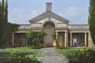
Gledstone Hall, Yorkshire
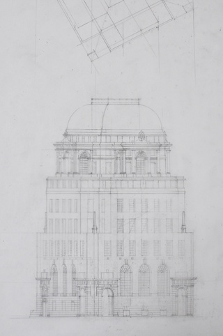
Former Midland Bank, Manchester
And his buildings certainly do reward the study. In trying to construct accurate drawings of his buildings, one discovers very subtle use of proportion. For instance, the windows in his Manchester Midland Bank (above) very slightly diminish in size but remain the same in proportion as they become higher in the facade. This is almost unnoticeable, attributable to vertical perspective, but in drawing the facade it becomes apparent that the arises to the window openings actually do step in as they go up. This is verifiable on Google Satellite where viewed from above the windows get noticeably larger as they get further away, perspective no longer working with the recession built into the design. Is this related in some way to the graded stonework that occurs on Lutyens’ bridge at Compton, based on traditional wall construction where the largest stones are at the bottom and they decrease in size up the wall reflecting the greater effort required to lift them into position? I have since come across this quote in a Pevsner article on Lutyens written for Architectural Review in 1951, “At the Midland Bank in Poultry every course of stone had to be 0.273 inch less in height than the one below.” It is a constructional logic but also has a perspective effect, enhancing the sense of recession vertically. This effect also occurs often in the grading of roof tiles on his buildings, can be seen in the slight batter to the attic storey on some drawings of his Municipal Art Gallery, Dublin, in his tendency to sketch his designs from ground level or even lower with dramatic recession upwards and is perhaps related to the famous entasis on the Cenotaph?
Other subtle variations occur in the facades avoiding dumb repetition of elements. Windows are reduced or increased in size to reflect a change in importance, but the proportions maintained. Wall planes are manipulated very slightly, rather like with Hawksmoor, to give us more information about what they are doing and to define the proportions which regulate his designs. I have the sense of an architect whose designs are ruled by proportion rather in the way that Inigo Jones used proportion, to unify the elements of his architecture; to ensure all elements were related. I sense it is proportion rather than numerical measurement that is significant; how elements relate proportionally to each other rather than an abstract mathematical system of dimensions. However, I could be wrong, as I am told by the owner of Homewood that Lutyens’ motto was Metiendo Vivendum – By Measure We Live; and mathematical games with windows, adding and taking away panes, playing with numbers of bays and creating complicated rhythms also are clearly occurring, disrupting symmetry in favour of balance, not to mention the Midland Bank stonework Pevsner refers to above.
8th July, 2013
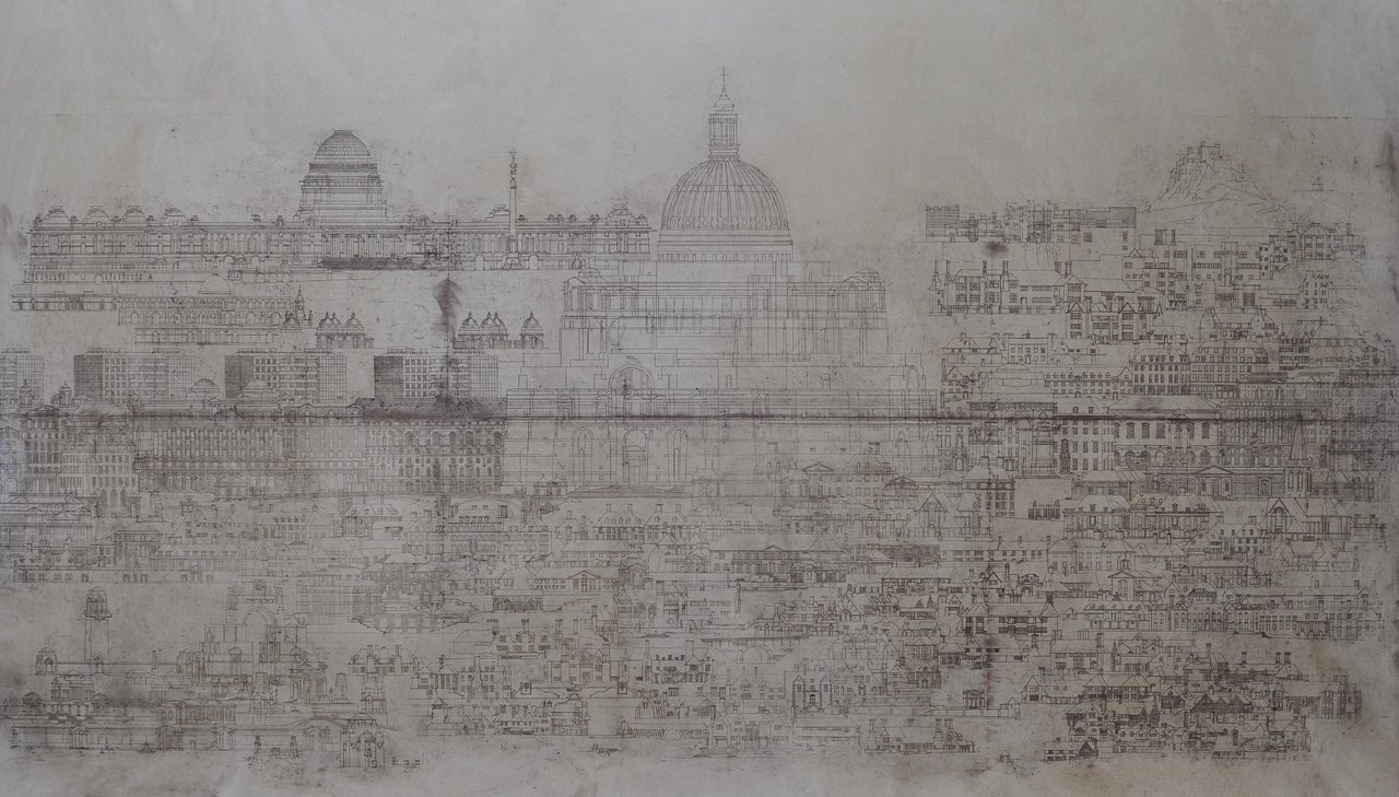
28.06.13
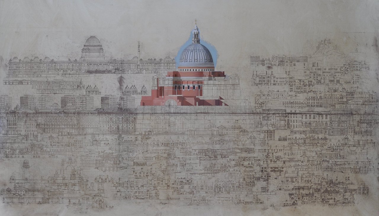
4.7.13
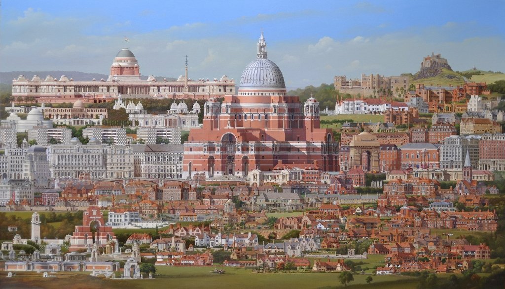
After five months of drawing up buildings for the Lutyens capriccio and another fortnight combining them into a composition and transferring that onto canvas, I am at last ready to start painting – after a quick trip to Normandy to see two of his houses, Le Bois des Moutiers and Les Communes, and several of his war cemeteries.
In drawing up the buildings, to maintain a degree of consistency, I kept everything at 1:200 scale.This was fortunate as it exposed the most astonishing discrepancy in scale between Lutyens’ design for Liverpool Cathedral and many of the houses which would very nearly fit in the entrance of the Cathedral. I had to check this several times thinking I must have made some error of conversion somewhere along the line – easily done when working from Lutyens’ imperial scale drawings and converting them to 1:200 metric drawings. But no, the Cathedral was spot on in its measurements. I decided that this aspect of scale should remain as a key element of the painting and that rather than create a scene in perspective everything should remain at 1:200 throughout so that comparisons between the buildings could be made. To reflect this idea, I also decided to title the painting, at least for the moment, Metiendo Vivendum, Lutyens’ motto, by measure we live.
Measure is also important in the sheer volume of work represented. Although the painting does not include everything he built, I think all the major directions his architecture took are represented. To my mind this is justification enough for the painting if justification is needed. Being a visually oriented person, to see the work collected together as an image is far more effective to me than a simple list of the work, as it shows immediately the quantity and the variety of it. In fact, if I had had a visual image of his body of work I probably would not have embarked on this project.
At this drawing stage it appears something of a jumble but I hope some order will develop with the application of paint as it was in my mind as I placed the buildings. There are some basic groupings of related building types but also the occasional contradiction of that order which I hope is in the spirit of Lutyens. War memorials are grouped together on the lower left. Vernacular and arts and crafts buildings are on the lower right with Le Boit des Moutiers and Les Communes joining Normandy to Surrey via Norfolk (The Pleasaunce which I think if seen as a composition of buildings is far more interesting than usually assumed).
Out of this chaos of smaller scale, mostly domestic architecture, develops a grander scale of “Wrenaissance” houses like Great Maythem, The Salutation, Middleton Park, The British Embassy in Washington, the more Italianate Heathcote and the large scale composition of Hampstead Garden Suburb which, kept in its true scale relationship, stretches half way across the composition from Erskine Hill to St Jude’s Church. Above this rises Liverpool Cathedral set in an urban landscape of his Midland Bank buildings, Reuters, Country Life, etc. with even a flirtation with modernism in his Page Street housing?
Beyond and above this cityscape is a grouping of “castles” on the right and New Delhi on the left.
Although not a true scene in perspective, I hope that this arrangement will have something of the feeling of a medieval city with the Cathedral rising out of domestic architecture surrounding it, order out of relative chaos.
5th August, 2013
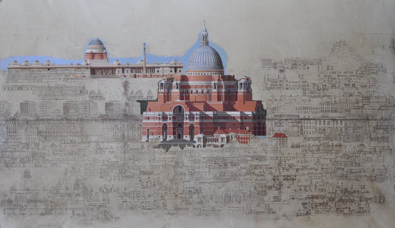
26.07.13
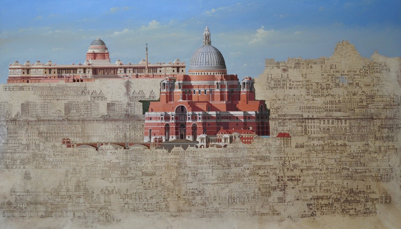
31/07/13
Three weeks painting sees Liverpool Cathedral nearly complete. As the centre of the composition it was chosen as the obvious starting point as it will probably set the tone for the whole painting. Painting the Cathedral felt more like carving a sculpture than painting. The subtle set backs in the facade which are so important in this building were quite difficult to work out from the model and Lutyens’ drawings which often contradict each other and the absence of a completed building means there is no definitive resolution to some of these contradictions. My setting out drawing was quite rough and did not fully take into account the subtle set backs to the facade. Consequently, the sensation of carving the facade, as I constantly found I had to shave off the depth of a moulding to get the correct relationship between one part of the facade and another. My feeling painting Liverpool Cathedral was that Lutyens was very much like Cockerell in his virtuoso use of mouldings and very much like Hawksmoor in exploiting all the many layers that can be found in the depth of a masonry wall.
Having seen Thiepval just prior to starting the painting of the Cathedral was a great help as very similar rules apply to each, with a system of arches increasing in scale, with the facade stepping back at the springing point of an arch to accommodate the depth of the moulding of the arch. This set back is such a subtle awareness of the detail of construction and it is so important to the design. It is almost as though the detail led the design. I was fortunate to see Thiepval at all, as the week after my visit, renovation work was to begin, which I assume would involve scaffolding and plastic sheeting which I usually find arrives a week before me rather than after! I would have really struggled to understand Liverpool Cathedral without seeing Thiepval.
18th August, 2013
18.08.13
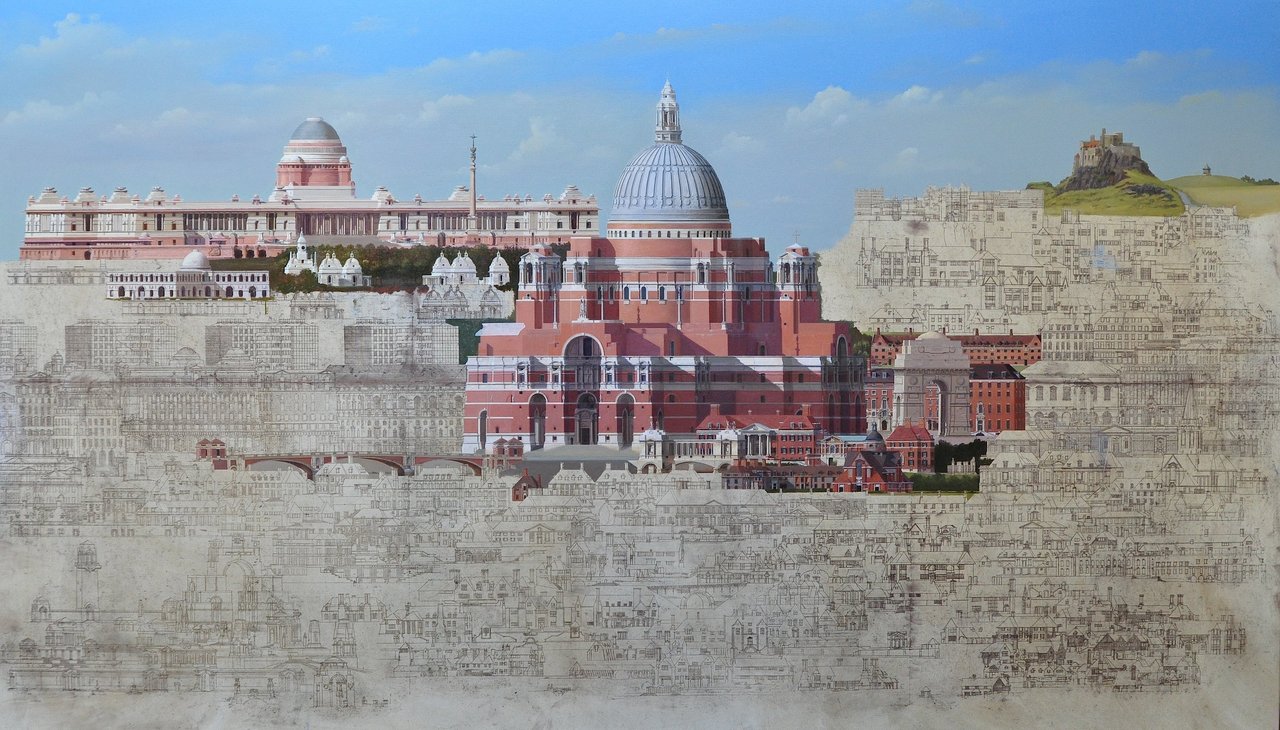
The first, probably of many, changes to the arrangement on canvas as I discover that I have left out the British School in Rome! The best location seems to move the “Schedule B” buildings from New Delhi slightly upward to make room for the British School. It should sit comfortably with these other white, “hot climate” buildings and also be interesting juxtaposed with the belfries of Liverpool Cathedral, and hopefully create a diagonal from Liverpool Cathedral up to the Rashtrapati Bhavan.
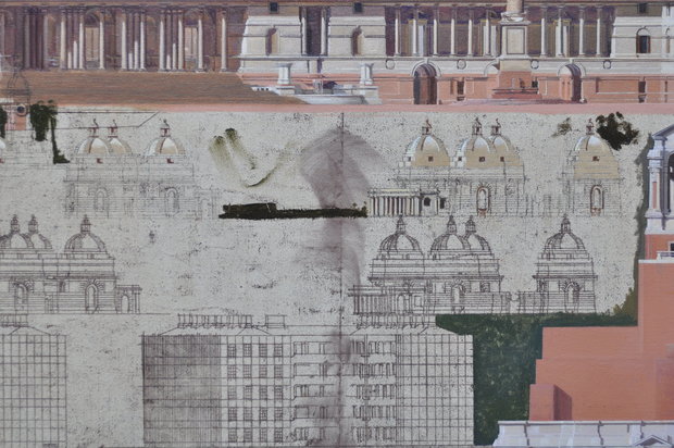
detail from 18.08.13

18.08.13
20th August, 2013
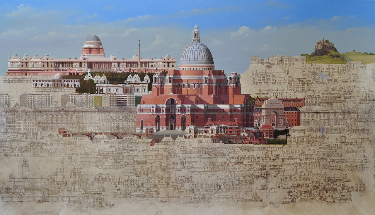
The British School is added.
20.08.13
28th August, 2013
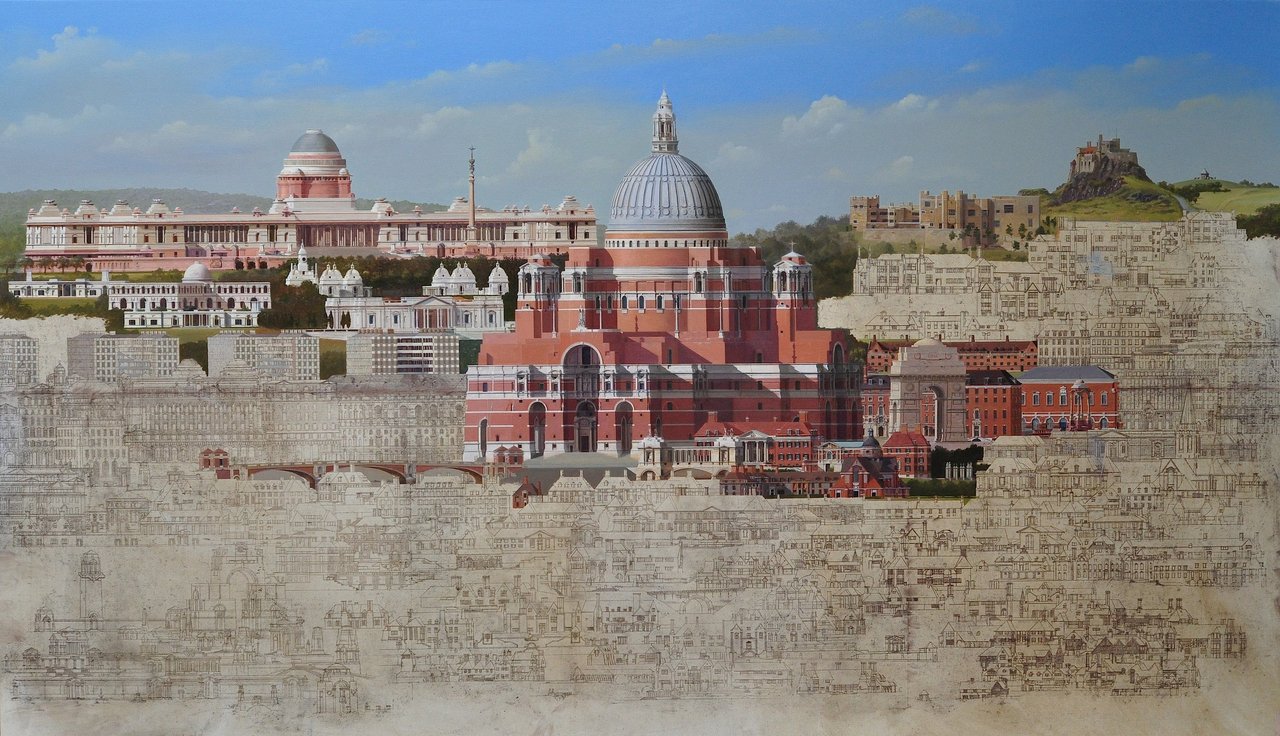
After visiting Castle Drogo and the”Pimple” on Dartmoor. Castle Drogo was totally enveloped in scaffolding but I was able to get some feel for the landscape setting which also led to a better landscape setting for the “Pimple” and introducing the Raisina Hills behind Rashtrapati Bhavan.
28.08.13
15th September, 2013
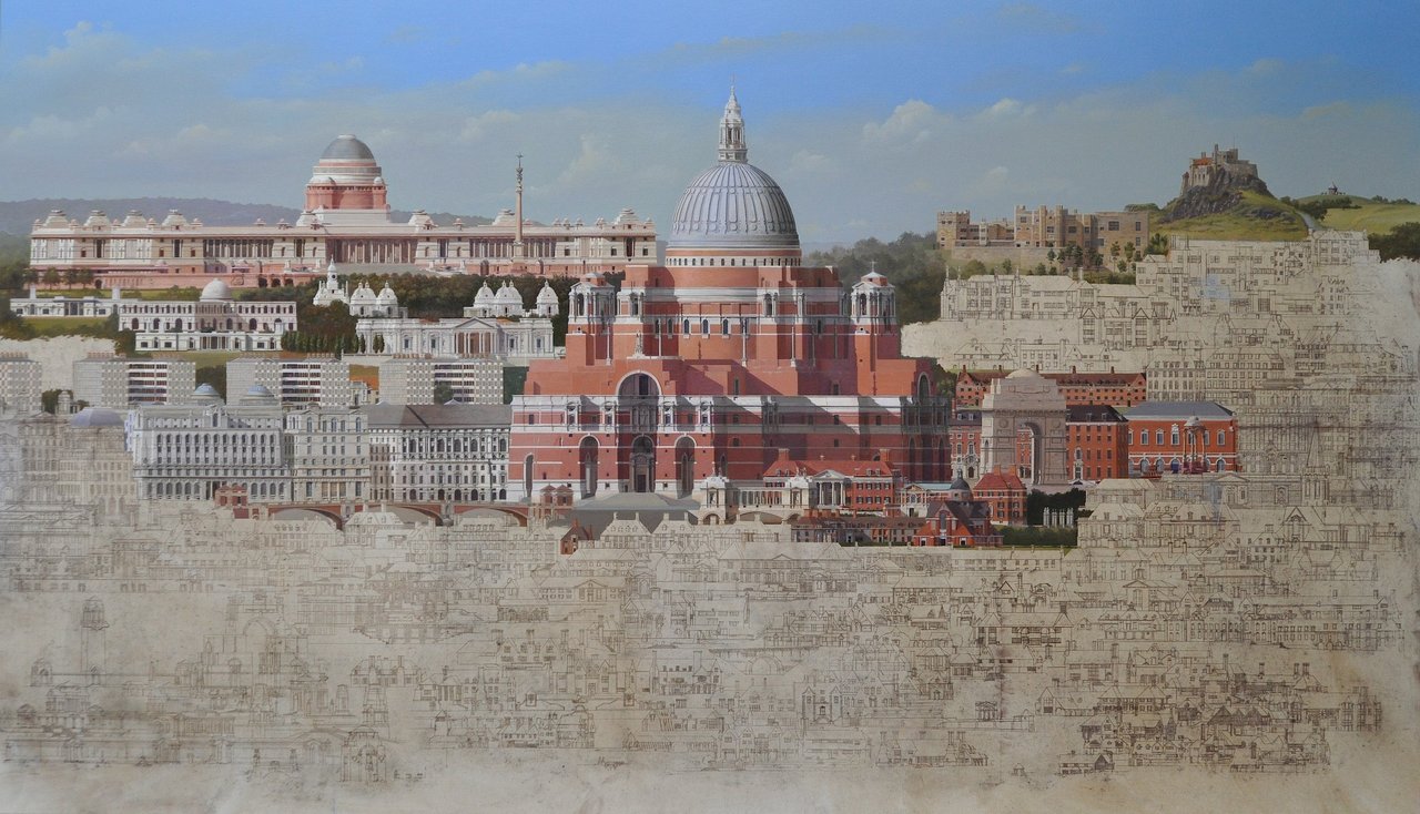
15.09.13
I have been working on Lutyens city buildings, Brittanic House, Pall Mall and the Midland Bank, Poultry. These are very slow going as they are very finely detailed and delicate with the now expected subtle use of set backs in the facade that is very difficult to depict. I have been five days working on the Midland Bank. I had a Gustave “I spent all morning putting in a coma and all afternoon taking it out” Flaubert experience, spending all morning painting the rustication to the pilasters on the Midland Bank, found it crude and spent the afternoon painting it out. The addition of these buildings does begin to make the scale of the Cathedral more plausible.
29th September, 2013
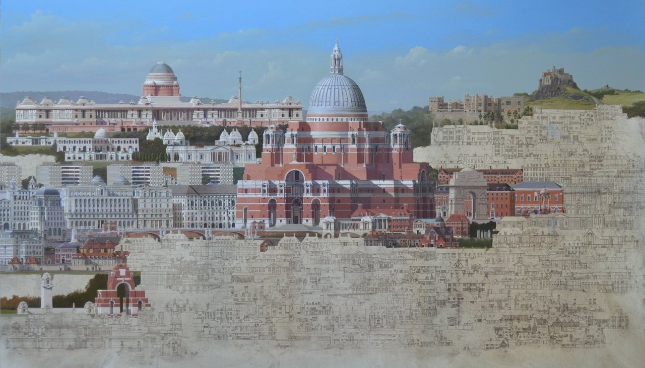
29.9.13
Having painted a riverside wall of Lutyens’s office buildings I seem to have painted myself into a corner! Trying to complete his Hampton Court bridge in front of the office buildings there is no where dry to rest my hand or a marl stick, so I must put my attention elsewhere until this area is dry. I go over the Cathedral trying to clarify the brickwork planes in relation to each other, and tidy up the dome and lantern. Then I decide to treat myself, with the Cathedral brickwork and arches still in mind, to painting Thiepval, interspersing this with reading in the garden Gavin Stamp’s wonderful and moving book on it, The Memorial to the Missing of the Somme, in what must surely be the last fling of beautiful summer sunshine and blue sky.
4th October, 2013
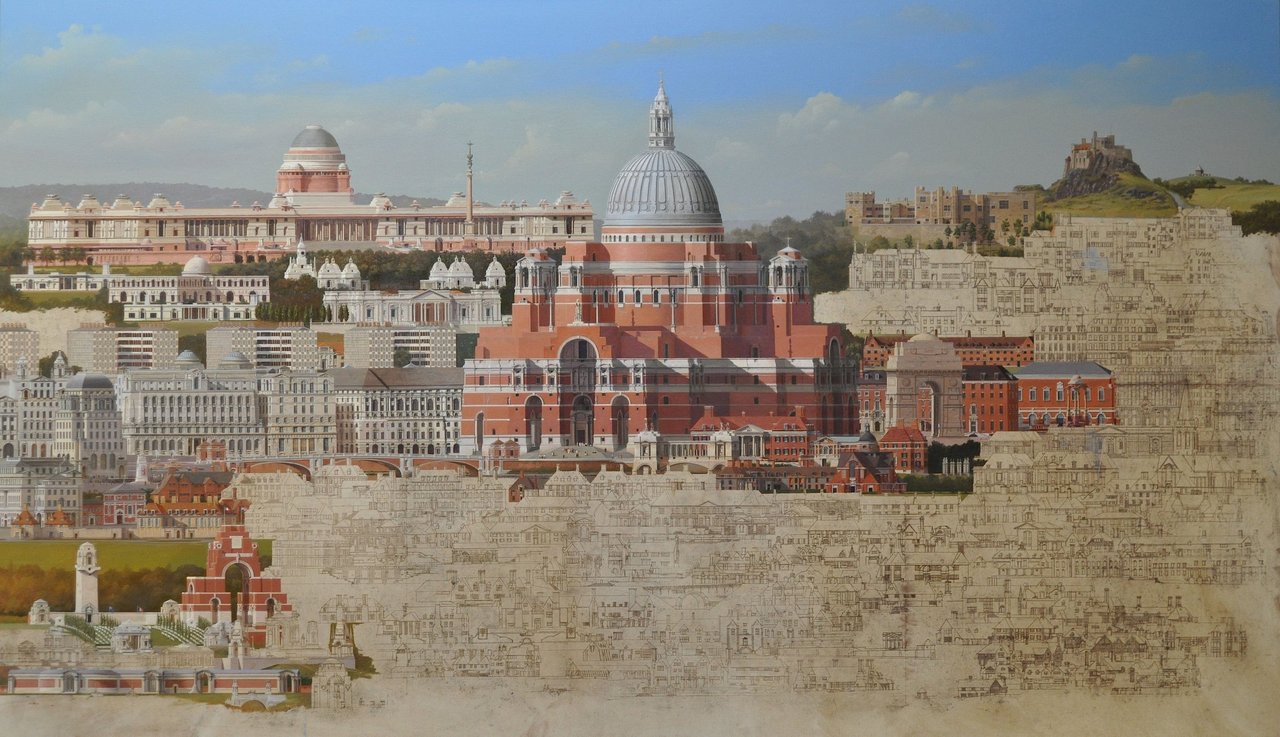
4.10.13
As I struggle with the mouldings at Faubourg D’Amiens Cemetery it is clear to me that painting these buildings at 1:200 scale is quite a challenge. It occurs to me that I may be painting an eight foot long miniature! The mouldings and little set-backs are so small at this scale that it is difficult to paint them in a way that they register but are not overemphasised and made rather grossly out of scale. It would be possible to simplify/abstract the design to make it more appropriate to the scale of the painting, leaving out some of the details, but I feel the designs are so driven by the details that this would be a mistake. There is a dialogue about construction going on in these designs, especially in Lutyens’s “elemental” buildings that I have never come across before, where the smallest detail effects the whole; where details and the architect’s reaction to them create an aesthetic that determines and generates the form of the building. Perhaps it is not possible to get this across in the painting but it must be worth trying. Perhaps there is another painting that concentrates more on the details.
It seems important in depicting the Somme memorials to also include some of the actual cemeteries and not just the buildings. So the entry pavilions to the Villers Bretonneux Memorial are moved to the right of the position where they were drawn to approximate the correct relative position to the tower, allowing the cemetery to be inserted as it exists.
16th October, 2013
I was recently visited by a relative who has always advocated my telling the “story” behind a painting – something I have always disliked and resisted, feeling that this puts my own interpretation in the way of a viewer developing their own “story” which might well be far more interesting than what I had in mind. This has certainly been the case in the past with a number of my paintings. I reluctantly decided to record the development of this painting as it is so complex and I know I will forget in time the different issues that came up in its creation which shaped it, and perhaps my relative was right and these should be remembered, so I will carry on telling the “story”.
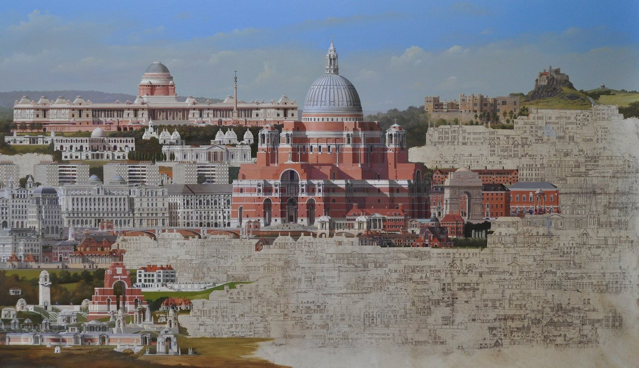
16.10.13
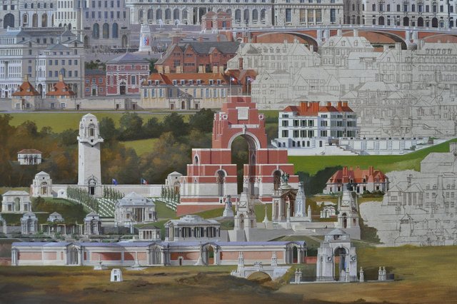
Close up of Memorials
I have pulled Thiepval forward again as its base was being concealed by the Villers-Bretonneux Cemetery I was at such pains to introduce as a complete composition! This diminished Thiepval’s impact and it is much better now with its full height visible. Peter Blake at one point painted portraits with only one eye rendered, claiming once you had painted one it was not necessary to paint the other. perhaps the symmetrical entry pavilions at Villers Bretonneux can be seen in the same way, and depicting one will imply the other. Léon Krier did something very similar with a Palladian villa, removing the duplicated elements from the composition.
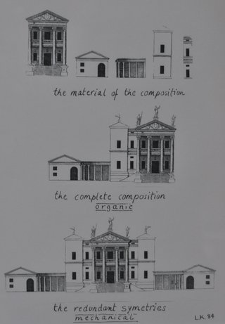
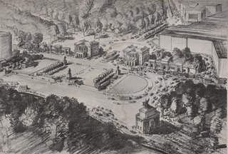
I think Lutyens’s attitude towards symmetry was quite different though and the Palladian duplication of elements to create symmetry was a major weapon in his compositional armoury, as in his proposal for Hyde Park Corner, duplicating Apsley House with the adjacent screen and arch:
Gavin Stamp in his book on Thiepval, The Memorial to the Missing of the Somme, quotes J. M. Barrie’s letter to Lutyens regarding what he had achieved with the design of the Cenotaph, “It is how the war has moved you and lifted you above yourself”. What I have not come across any mention of is how the change to the landscape of the Somme may also have moved him to create such sublime memorials. He must have known the area well, having built the two houses at Varengeville before the war and returning during the war to see the battlefields which had previously been peaceful countryside must have been distressing to a man so attuned to the effects of landscape. His description of his visit to the temporary cemeteries on behalf of the War Graves Commission in 1917 in a letter to his wife makes it clear how deeply he was moved by what he saw. I think someone whose architecture is so rooted in a sense of place would also be profoundly affected by the change brought about by the war in a place he knew well, and this may well have deepened his reaction to what he saw in the Somme.
I fear I have not done justice to the war memorials, the collision and energy inherent in the idea of the capriccio being totally at odds with the serenity of Lutyens’s Somme cemeteries. The uniformity of the headstones fought for by Lutyens and the calm contemplative spaces he created are so far removed from the jumble of monuments of the usual cemetery which is much closer to the one depicted here, I think Lutyens would hate this! In composing this area of the canvas, I was thinking more along the lines of Piranesi’s depictions of Roman funerary architecture in his frontispieces to Antichita Romane. I had not yet been to the Somme cemeteries and experienced them first hand with their quite different sense of calm. In fact when we did visit the Somme, at one point we walked through an existing cemetery at Béthune, which was like a funerary junk yard and very akin to the Piranesian model, to reach Lutyens’s typically calm and meditative military cemetery. They were worlds apart in concept. But a painting with perhaps 200 buildings in it (I still have not dared count them) will never be serene. Hopefully the elegance of the individual buildings will still register. There are things I can do in this work, and others that will escape me. I can still give an idea of the range of Lutyens’s architecture, his limitless invention, and must accept that this is at odds with the peacefulness of the individual cemeteries.
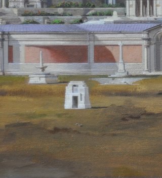
Perhaps the isolation of the little entry at La Neuville British Cemetery, in a kind of “No Man’s Land” in the foreground, can convey a sense of the silence and dignity to be found in the cemeteries, although it is difficult to imagine that a 30×40mm patch of white in an eight and a half foot long painting will have much effect.
Still, I remember doing a painting of fragments of French classical architecture which were stripped of their ornament apart from one residual “egg and dart” and a volute which carried a presence and a memory of the absent decoration that was surprising to me.
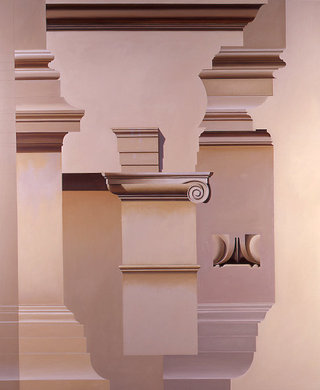
Architectural Composition III,183cmx152cm, oil on canvas, 2003
The little entry at La Neuville is powerful beyond its size. One of the most simplified of all the structures we saw in the Somme, it has the feeling of some ancient Minoan tomb with its battered walls and door surround and the solid slab roof suspended above an opening to emphasize its weight. Perhaps it can have a presence which will draw attention to itself and convey something of the dignity of Lutyens’s memorials.
3rd November, 2013
3.11.13
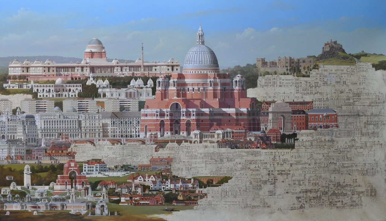
The country houses are now starting to appear. I am stumped by the lack of information on Barton St. Mary, so I must try and visit it. The days are so short now, my painting time is halved. And to think that the days will continue shortening for nearly two months before we start to crawl back towards spring! It will be nearly four months before we get back to the meagre amount of daylight we have now!!
One of the absences that bothers me is the British Pavilion at the 1928 Antwerp Exhibition. It has many elements that relate it in my mind to the Viceroy’s House and the Faubourg d’Amiens cemetery, but it is hardly ever mentioned, so it should be included. I think it could peep through the Page Street housing and its dome would then relate to the many New Delhi domes above and those of the Poultry Bank below.
23rd November, 2013
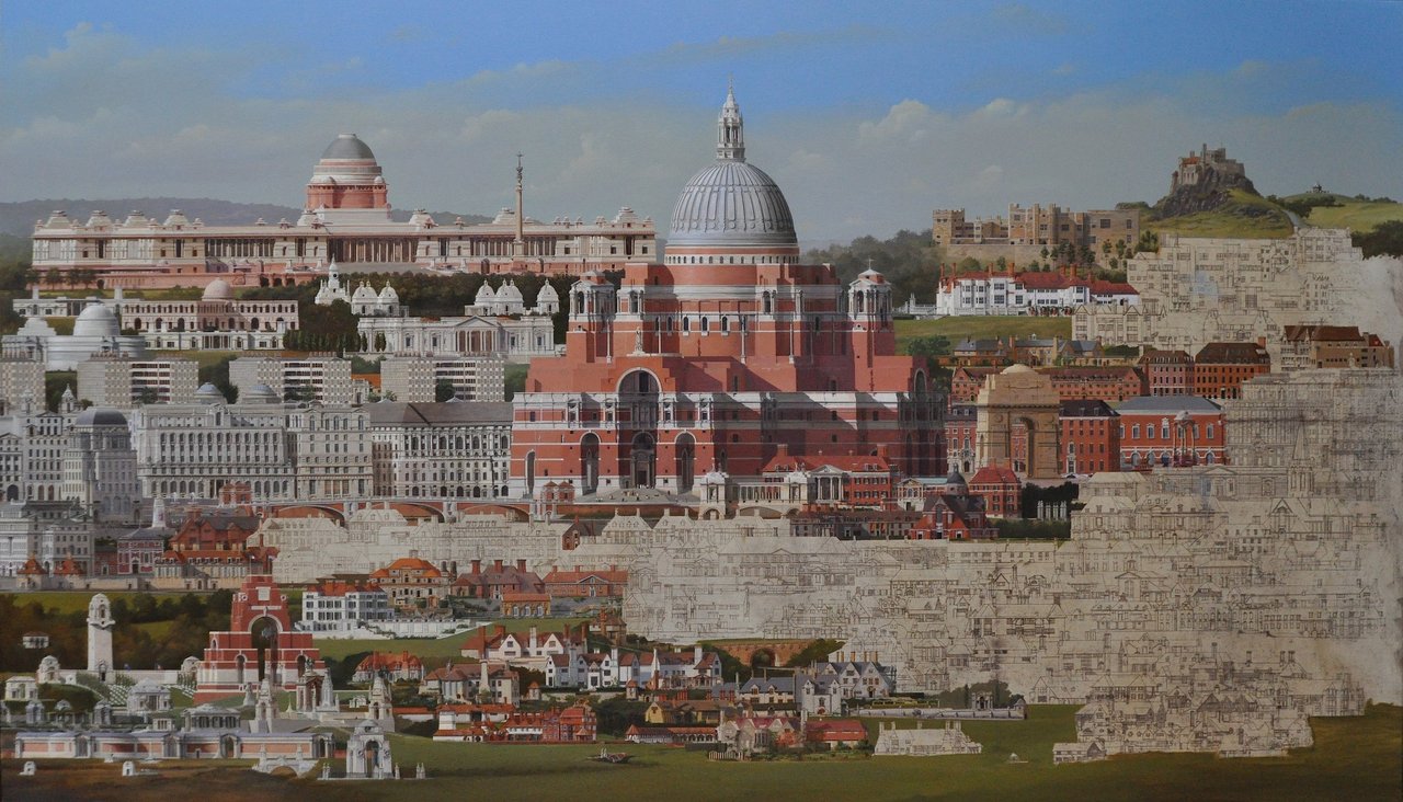
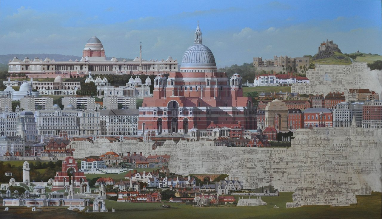
The hours of daylight for painting are so short now. I can do some work by my colour matching fluorescents but usually find the following day the colours are not quite what I had intended. On the positive side, I have managed to get the central band of urban buildings all the way across the canvas, if not finished in all their detail. Having a number of buildings on the go at once which I can keep going back to when they are dry for the next layer of detail is preferable to trying to complete a building in one go. Building up the colour and detail is much more successful. I have gone over the Viceroy’s House, tidying up some of the areas that have been painted over by sky, adding water to the fountains on the roof and changing the shadows on the loggia to make the positions of the columns clearer. I have added the Antwerp Pavilion and I think its dome works well where it is placed.
Down in the lower band of country houses, I have included two Papillon Halls, one external view and one in section showing the central circular courtyard. I had wanted to include this latter view as it is so unexpected. The fact that Papillon Hall was one of Lutyens’s few works to be demolished provided the excuse to do this, showing the building under demolition, exposing the courtyard. As an added touch of salt in the wound, I included two workmen from an old photograph of Herbert Baker’s demolition of Soane’s Bank of England, carrying out the destruction.
I have also included two views of Abbotswood, as I wanted to show both the triangular facade Lutyens added to the entrance and the sequence of garden spaces.
Marshcourt was quite a challenge to construct as it is still being renovated and the gardens were particularly hard to piece together from my visit, but I like the way it sits on the hill, reaching into the landscape with its garden walls.
18.11.13
23.11.13
19th December, 2013
Now that the houses are starting to appear in some quantity, the painting is developing an interesting overall texture rather than being a number of isolated events. I hope it is a texture not just of buildings but also reflects the rich texture of Lutyens’s career and something of the social history of the twentieth century that is embedded in the twists and turns his work was to take. The effects of two world wars and the social changes they brought are visible in the architecture and hopefully woven into the painting.
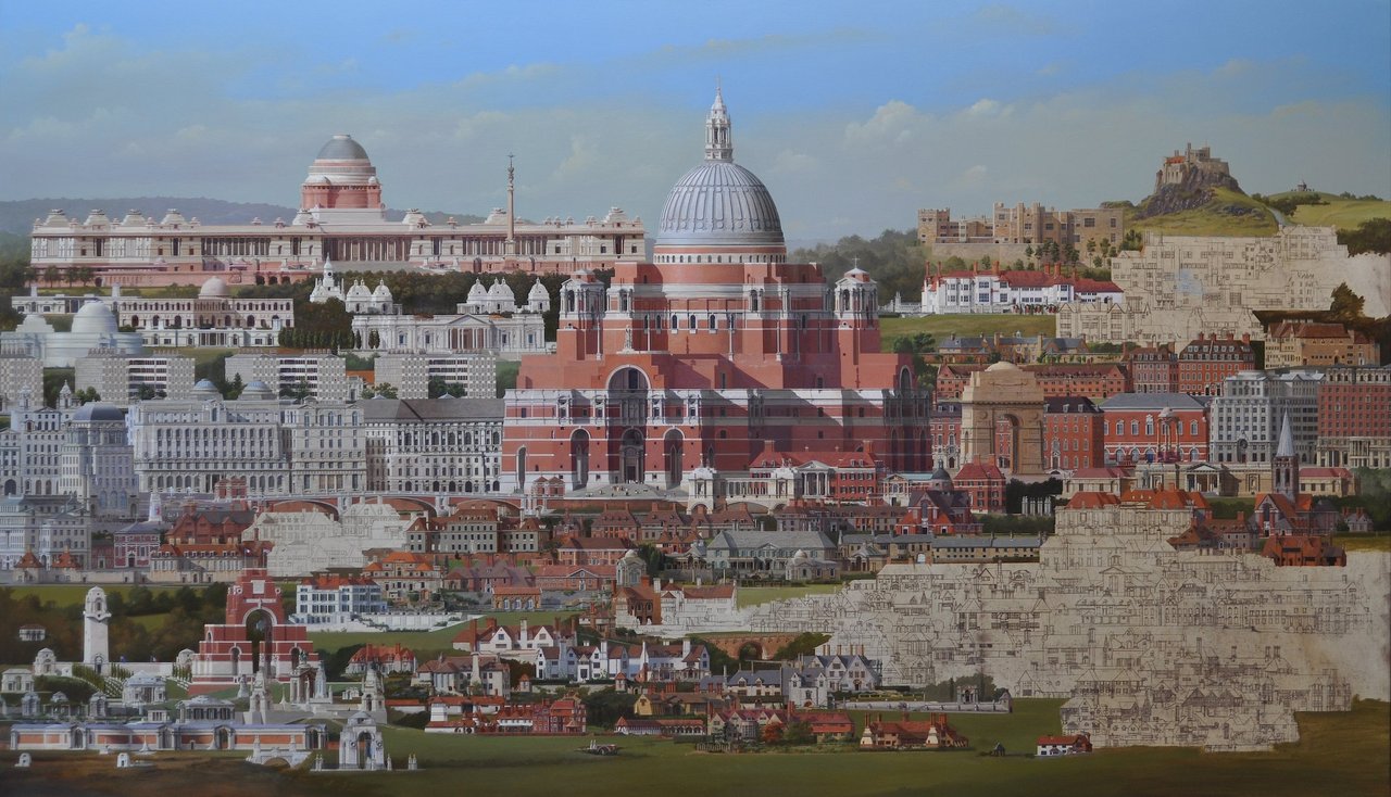
19.12.13
15th January, 2014
Continuing to fill in houses, a satisfying moment was completing the composition at Hampstead Garden Suburb with the houses on Erskine Hill and North Square, the two churches and the Institute. This stretches more than half way across the canvas and the buildings are in the relationship to each other that exists apart from the houses having been flipped to the east side of Erskine Hill and North Square so that the street facades are visible. I have also started on the group of houses in the area around Hitchin (Ashwell Bury, Temple Dinsley, Homewood, Hill End, etc.) which I will find particularly enjoyable to paint. I must find a way to incorporate the painting I did of the Limewalk at Knebworth House many years ago to represent the garden Lutyens designed there. I have gone over the Cathedral and All India Gate again, trying to make the shadows describe the form and depth more coherently. I think the Cathedral’s form is now clearer.
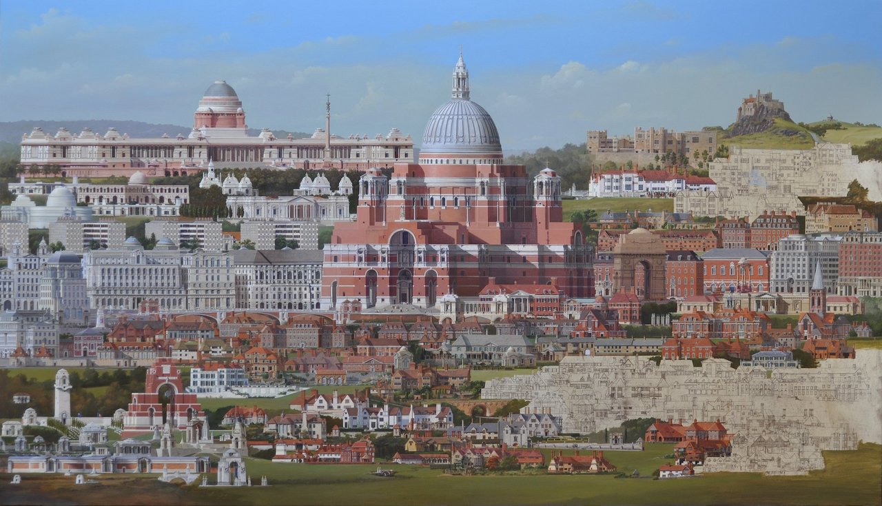
14.01.14
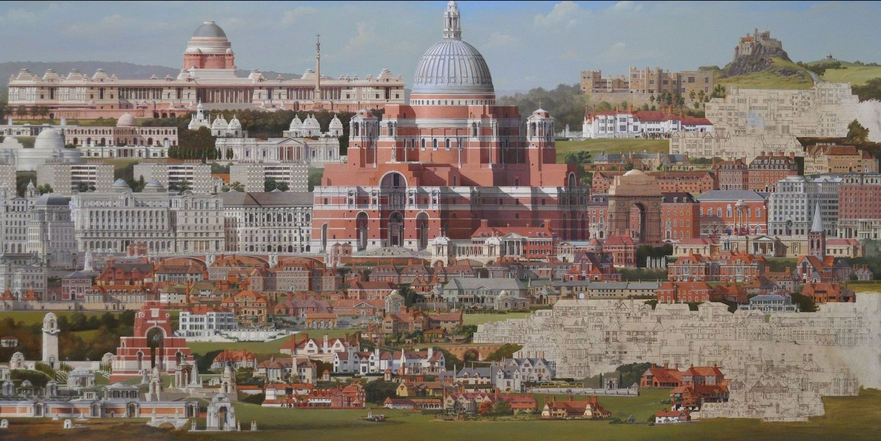
15.01.14
24th January, 2014
Working on the country houses, the ones I have been able to visit are a treat to paint, while those I have not been able to get access to require a lot of detective work to flesh out. It is one thing to put together drawings setting them out and quite another to render them convincingly. It often means scouring old photos for tiny clues about materials and details, going back and forth between the photos and drawings in the Lutyens Memorial ( 4 volumes of descriptions, drawings, and photographs of Lutyens’s work published in 1950 ) and other published photos, but it is very satisfying when it works out.
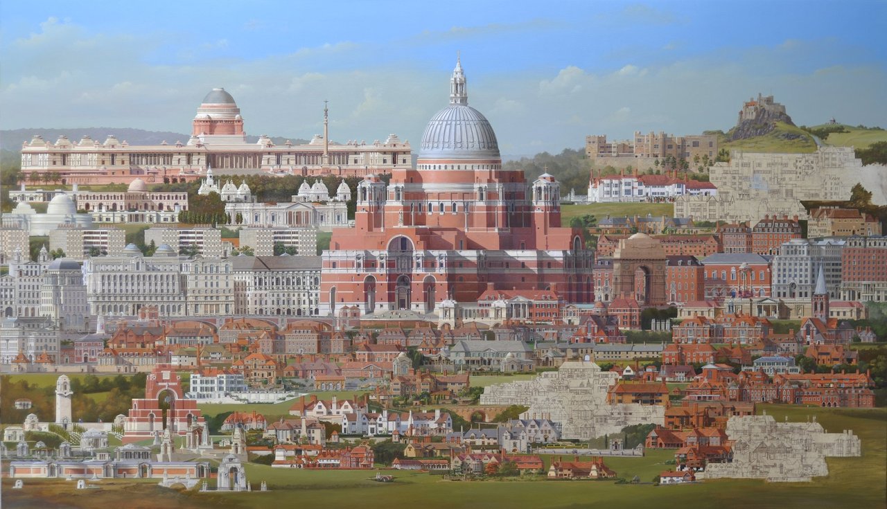
24.01.14
7th February, 2014
Only a few houses left and then I can start going over the whole painting, strengthening the forms, sharpening the details, balancing what should come forward what should step back, unifying the overall texture and adding some life here and there. I have been struggling trying to depict convincingly – as convincingly as the buildings I have visited – the houses that I have not been allowed to visit. They have been reconstructed from existing publications but often only from drawings or old black and white photos from Country Life or Lawrence Weaver’s Houses and Gardens by E.L. Lutyens. It is quite difficult to invest them with the same presence as the houses I have had the good fortune to visit. Along come two people to the rescue. Andrew Barnett at The Lutyens Trust Photo Archive has located masses of images of many of the elusive houses for me and helped clarify what is original and what is a later alteration. He even pointed me to a book on Lutyens houses that I do not have. The Photo Archive is a wonderful source of images, both historical and contemporary.
Likewise, Michael Edwards, an architect who has done restoration work on a number of Lutyens houses, has offered useful advice, drawings and photographs on houses where I lacked information, and added a few rarities like a pergola at Chinthurst Hill that has since been demolished. I am very grateful for both individual’s invaluable help and generosity with their time.
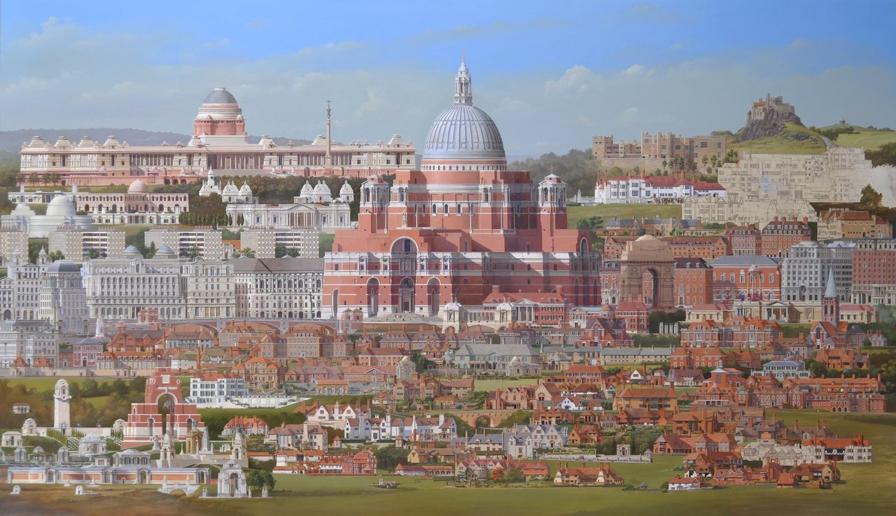
7.2.14
19th February, 2014
Today is the “topping out” ceremony – all of the canvas is at last covered! Now the balancing and refining starts, although the buildings in the upper right still need to be finished. I found a place among the “castles” in this upper right corner for a tiny version of The Lime Walk, a painting I did 34 years ago of the garden at Knebworth, not knowing it was designed by Lutyens. An appropriate location in the painting, I think, Knebworth having the appearance of a castle. I have also today been to the sawmill in Ayot Green to select some oak for a frame and arranged to have it milled to a simple profile.
In looking for information on brickwork at Middlefield, Great Shelford, I came across fascinating minutes from the Annual General Meeting of the British Archaeolgical Association: Brick Section! The bricks used at Middlefield according to these minutes were only 45mm thick and those proposed for Liverpool Cathedral were 38mm thick x 600mm long. It is also recorded that Lutyens’s preference for local materials led to clay from the site being used to make the bricks to build Daneshill at Old Basing, and this source was later developed by his client into the Daneshill Brick Company.
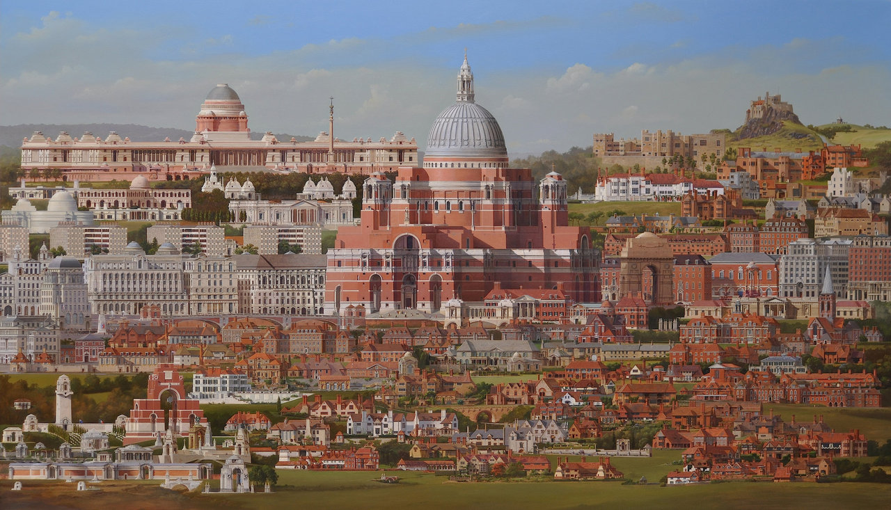
19.2.14
26th February, 2014
In painting Howth Castle, a rather wilful non-alighnment of windows became apparent. This is different from instances in other buildings where there is a logic behind the movement of windows in relation to each other, for instance, to intentionally avoid symmetry. Here, on the southwest elevation, a window is slipped a few inches to the left of where it would be centred on the windows above and below, perhaps to mimic the utilitarian construction of a castle? I almost did not catch it, it was so subtle and I am so used to setting out windows from a centre line which is how the adjacent range of windows is set out. Another non-alighnment of windows happens on the southeast elevation, but here it is much more calculated, two sets of symmetries determine the window positions, ranges of three equally spaced windows on the bottom two floors centred on the overall width of the tower with a pair of sashes centred on the spaces between them on the floor above, but with a single sash above these centred in the corner turrets and apparently not related to the windows below. Here, the arrangement appears not like that of a practically built castle but rather a very dynamic composition of diagonals, with a pyramidal arrangement of windows overlaid with an upside-down pyramid of windows.
I noticed something did not seem right with the entrance to the Cathedral and eventually worked out that the lighting was not correct; it would be much more complex than what I had painted. I had in fact, painted all the light as coming from the left. If the source of light is on the left, it should, in the arched openings, reflect off the right hand wall onto the recessed wall parallel to the facade, so that, in effect, it is coming from the right in these shaded openings. Much better now, although it still needs a little tidying up.
This is the kind of thing which makes painting buildings which do not exist such a challenge. It is necessary to imagine the effects of light, weather, age, the colour of materials. I think more thought needs to go into the colours in the shadows here, the reflected light probably giving some of the brick colour to the stonework. I was amused recently to read an artist writing that the amateurish error many painters make is to paint what they know rather than what they see; but here there is nothing to see until what one can know is put down in paint.
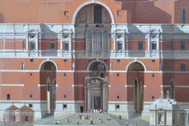
26.2.14
9th March, 2014
Going over and over the painting, deepening shadows, sharpening edges, adding people and landscape. I have put a small hunt gathering (presumably drag hunting!) adjacent to the stables from Lady Grove Farm in Knebworth as an acknowledgement of Charles Lutyens, father of Edwin, an equestrian painter. I have also put a crowd and traffic outside the National Theatre and, wondering what performance to announce on a banner, decided Measure for Measure was appropriate. A few changes to the shadows on the Cathedral has made them more consistent, and the Page Street housing has been made more intense. The Indian flag now flies over Rashtrapati Bhavan.
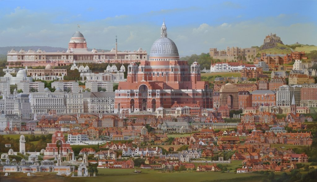
9.3.14
18th March, 2014
I made my final visit for the painting this week to Ashby St. Ledgers on a beautiful, hazily sunny day. It is a magical place and it was quite special to be totally alone there in the garden.
After incorporating Ashby into the painting I returned to the Cathedral again, introducing a band of brickwork at the lower parapet level. There are conflicting indications for this on different drawings. The drawings he did to exhibit at the Royal Academy show all of the parapet as stone which is how I first painted it, but larger scale drawings in the Lutyens Memorial Volumes indicate a band of brickwork below a stone capping as does the model in Liverpool. I think these two latter sources are probably the later thoughts on the subject so I decided to introduce the brickwork. I think it makes the parapet lighter and more delicate.
I also revisited the All India Arch and changed the lighting of it for the third or maybe fourth time. I just did not find the direction of the light convincing. I had wanted the arch to be mostly in shadow so it stood out strongly against the light buildings behind it, but the source of light did not relate to the other buildings in the painting and the effect was rather dull. It is better now. Of course this necessitated changing the shadow the arch casts on the YWCA building beyond, which is also an improvement.
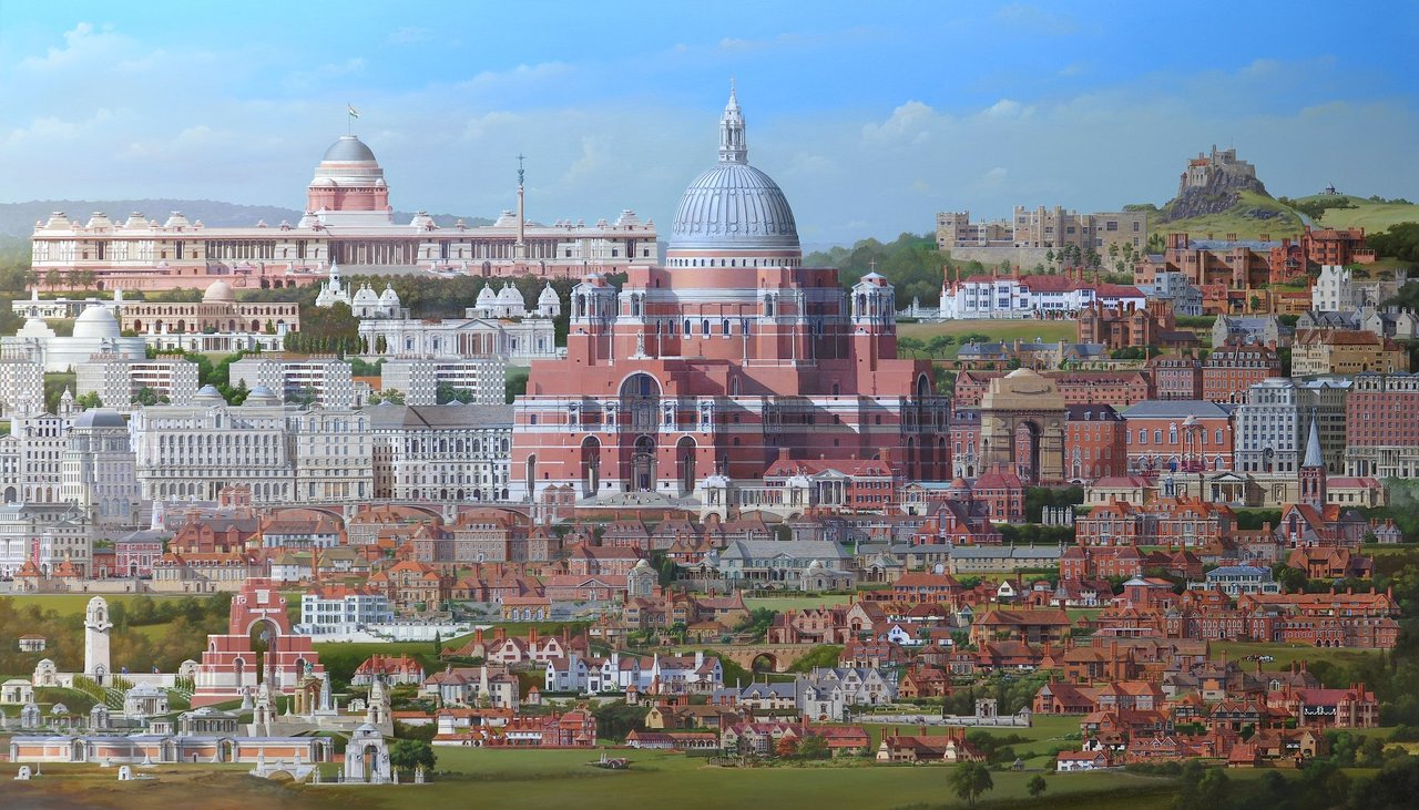
18.3.14
24th March, 2014
I have been going over the painting deepening the shadows, correcting details that have been misinterpreted or have been lost in working on the painting – there seem to be a lot of them! I felt the lettering of the dedication on the top of Thiepval was very crude so decided to tidy it up and found that it trolly wasn’t centred properly. In fact, the whole tablet was off centre so decided to repaint it. It is better now but still needs some work – a thin veil of glaze to soften it slightly, but it must dry between each bit of work.
During a visit from my GP, I was persuaded to include Queen Mary’s Dolls’ House, so have shown it being wheeled into the Hugh Lane Gallery for an exhibition. I was also persuaded to include a band of pipers we saw when we visited Thiepval on 30 June last year. Although they looked thoroughly Scottish, they were, in fact, French. They appear every June at Thiepval to honour the missing of the Somme.
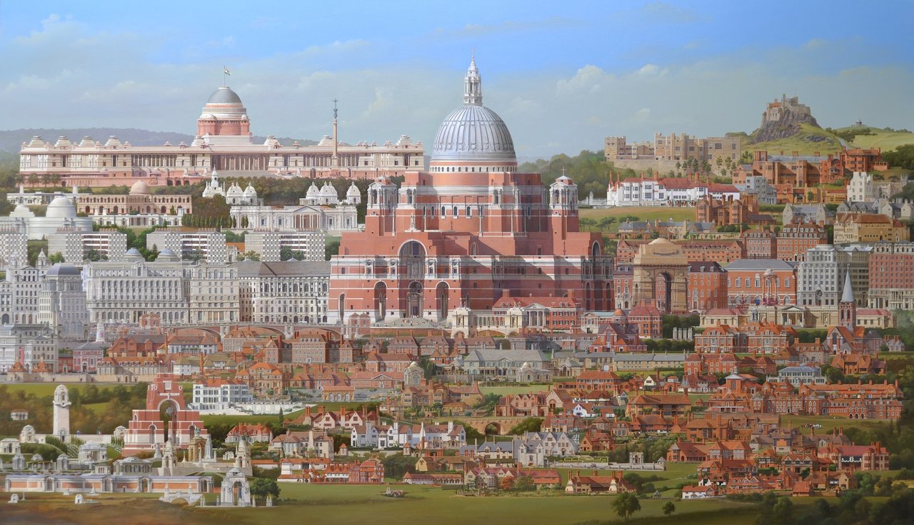
24.3.14
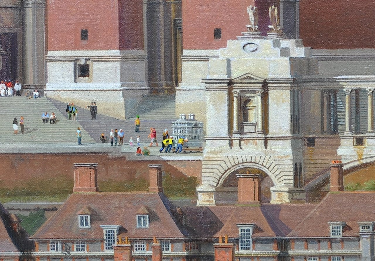
24.3.14 Detail of Dolls House
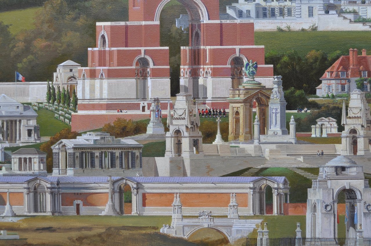
24.3.14 Detail of Pipers
7th April, 2014
A very curious optical illusion has been troubling me in a very minor point in the painting. A garden loggia which forms part of Temple Dinsley sits in front of Knebworth Golf Club. Both have similar little pavilions at the ends, but as they are not related I did not think it important they were not axially related. In fact, I thought it better they were not so that they did not appear to be parts of the same structure. However, because they are both symmetrical and have similar pavilions, the fact that they were not related axially caused a distortion so that the combination of buildings though not related seemed to be, and seemed to be twisted in plan. I attempted to get around this by putting some trees between them so that they were clearly not part of the same structure. Never a good plan. I felt it would be better if they were on axis with each other even though they are not related. The result is much happier and I think says much for the importance of the axis in relating buildings to each other.
I have gone over the Viceroy’s house sharpening some of the details and also the Cathedral. I have sharpened and altered the rustication the Johannesburg Art Gallery.
All the human activity seemed to be on the left of the painting so I added Hitchin’s Vaisakhi parade passing by All India Arch to the right of the Cathedral, and a newspaper seller by the Reuters Building. I have redone the meadow in front of Marshcourt. I do not see anything else to do. It’s finished.
7.4.14
The importance of scale to the composition of the painting led to the adoption of Lutyens’s own motto, Metiendo Vivendum (By Measure We Live) as the title of the painting, with the subtitle A Tribute to Sir Edwin Lutyens referring to C. R. Cockerell’s famous painting of the work of Lutyens’s great hero Wren, A Tribute to Sir Christopher Wren.
Taking Care and Letting Go
After working very precisely on a major, highly detailed project without break for a year and a half, I found, as is usually the case, a great need to do something less restrained, less hard edged, more intuitive, to enjoy the paint. This would normally continue until I would become dissatisfied with the lack of precision and detail and it would begin to creep back in again, taking me in cycles through precision and a more free approach.
By strange coincidence, just as I finished Metiendo Vivendum and was feeling this need to break out of “living by measure”, Bob Maxwell, partner at Douglas Stephen and Partners when I was working there thirty years ago, sent me a copy of his latest book, Ancient Wisdom and Modern Knowhow. I was gripped by the very first paragraph:
In my book ‘Sweet Disorder and the Carefully Careless’ I discovered for myself the existence of a permanent dialectic in the field of our culture. This dialectic oscillates between taking care and letting go, and locates the inbetween space in which creative discoveries are made. In broader terms, it lies between tradition and innovation, between continuity and discontinuity, and so, in a more literary expression, between Sweet Disorder, where the intuition takes over, and the Carefully Careless, where one stays
within the rules.
I know Bob was describing a process on a much grander scale, but I feel the concept trickles down to the individual as well. There was a resonance in this idea that rang through many aspects of the Lutyens project in particular and my painting in general. This was such an eloquent and affirmative description of the state I find myself in at the end of a big project like Metiendo Vivendum. What I had taken to be indecision or lack of conviction in wanting to suddenly go in the opposite direction to where I had just been was perhaps a vital aspect of developing as a painter.
Within complex large paintings like Metiendo Vivendum, there are, in fact, passages between the buildings that allow for a freer treatment which has an effect on the overall, so that within the painting there is a dialogue between “taking care and letting go”. The freeness in dealing with some of these invented landscape passages in the capricci leads to a different, broader understanding of how to treat landscape which then feeds back into smaller landscape paintings. The idea of a capriccio is also in itself a reflection of this dialogue between “taking care and letting go”, depicting something with great accuracy while blithely taking it totally out of its context.
This idea of “taking care and letting go” also gives an insight into Lutyens’s work, from his gardens where a rigid architectural framework is softened by Jekyll’s planting and Jekyll’s planting is made more expressive by being placed in a structured setting, to his attitude towards classicism – adhering to rules but not being afraid to bend or break them to suit his particular architectural intentions, and his willingness to employ a variety of architectural languages, “between tradition and innovation”.
