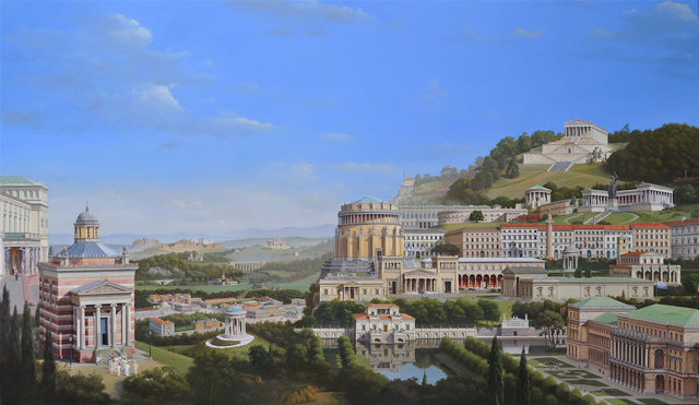
The new project is to depict the architecture of the German neoclassicist, Leo von Klenze (1784-1864), the Bavarian counterpart of the better known Prussian architect, Schinkel. I was planning to attempt a Schinkel capriccio when I was persuaded by David Watkin that von Klenze would be much more interesting and worthwhile as he is so little known in England. I first encountered von Klenze in about 1987 when Léon Krier gave me a book on his paintings and drawings. I still knew very little about his architecture when I decided on this project, but the general lack of knowledge about his work seemed like a good reason to undertake it. Later, looking for a date to give significance to producing a painting at this particular moment, like the cinquecentenario was relevant for the Palladio paintings, I found that 1816 (assuming I finished the painting by 2016) was the date when the foundation stone was laid for Klenze’s Glyptothek, his first major building and the start of his work for Ludwig I in Munich where many of his buildings are located.
Christine and I went to Munich armed with an A4 map from Léon which located all of von Klenze’s buildings in the city. We then went on by car to Pappenheim to see the palace he built there, Ingolstadt to see the fortifications, Kelheim for the Befreiungshalle and Regensburg to see the Walhalla. Everyone we met was extremely helpful in getting us into buildings and helping us to find the elusive ones. As an added bonus, I met several relatives in Munich for the very first time, astonishingly finding one to be an architect and two to be painters!
The initial problem in interpreting von Klenze’s drawings, and comparing them to measurements made on site, was that they seemed to have scales in feet, which surprised me. I would have thought they would have been metric as most of his work was post Napoleon. Then when I checked his drawing of the Walhalla with its scale against the measured restoration drawings which were in metres, there seemed to be a discrepancy of a few feet between them across the width of the building. A scale in feet was not the answer then. The correct solution turned out to be that Germany did not go metric until 1872 and various different measurements were used in different states prior to that date. The Bavarian foot turns out to be 11.5 inches or 292mm and appears to be what von Klenze used. This reconciled the two differing dimensions of Walhalla perfectly.
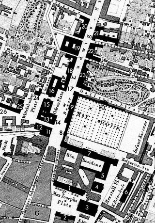
Having established the scale to von Klenze’s drawings, I copied at the same scale of 1:200 all the buildings by him on Ludwigstrasse, the street in Munich he designed to expand the city northward from the old palace, the Residenz. This comprises essentially everything from the Residenz to Theresienstrasse, about four city blocks, on both sides of Ludwigstrasse, resulting in a drawing at 1:200 for each side of Ludwigstrasse 4’’ high and 12’ long. This was clearly going to be a problem if the buildings were to be depicted at a size large enough to be identifiable and interesting. Perhaps the answer would be to concentrate on the area around Odeonsplatz at the southern end of Ludwigstrasse, for the foreground, and show Ludwigstrasse receding in perspective, foreshortening that 12’ length. This also would have the benefit of concentrating on the rather complex and interesting urban design of the Odeonsplatz area. Apart from the interest of von Klenze’s individual buildings, I found in Munich that I was fascinated by the sophistication of his urban design – the way he wove together the various elements, especially in that area around the Odeonsplatz, centering the Odeonsplatz on the Bazar opposite and placing the Hofgartentor archway centrally in the gap between the Bazar and the end of the Residenz and on axis with the new Briennerstrasse he created opposite. You can actually start in Max-Joseph-Platz, south of the Residenz, with Klenze buildings on three sides (the Konigsbau, the Staatsoper, and the Hauptpost); walk down the side of the Staatsoper and behind it to the Marstallplatz looked over by his Allerheilgenhofkirche, Marstall, and his east facade of the Residenz; move on to the Festsaalbau facing onto the Hofgarten with von Klenze’s buildings on three sides and then on through his Hofgartentor archway onto Odeonsplatz and Ludwigstrasse. A continuous sequence of Klenze buildings, or facades in some cases, all joined by carefully defined spaces to lead you on a “promenade architecturale” that I think is without equal in having been built by one architect.
This weaving together of individual buildings into a rich urban fabric made me think of Colin Rowe’s Collage City as I walked around Munich. The buildings remain distinct, rather than forced into a uniformity of architectural language or form (with the exception of the Odeon, which is a symmetrical copy of the Leuchtenberg Palais opposite, even though of a totally different function). I pulled my copy of Collage City off the shelf when we returned, to see if it referred to Klenze and was rewarded with a lengthy entry which it is worth quoting in full:
“But to introduce a concrete illustration of the problem (not wholly unlike the problem of today) which is presented by a utopia in which one has ceased completely to believe and a tradition from which one is critically detached. Napoleon I entertained the project of turning Paris into a species of museum. The city was, to some degree, to become a sort of habitable exhibition, a collection of permanent reminders which were to edify both the resident and and the visitor; and the substance of the instruction, one guesses right away, was to be some kind of historical panorama not only of the greatness and continuity of the French nation but, also, of the comparable (though surely slightly less) contributions of a mostly subservient Europe.So, instinctively one recoils from the idea; but, if it must for the present day command something less than enthusiasm (one is apt to think of Albert Speer and his unfortunate sponsor), one is still, with Napoleon’s idea presented with the fantasy of a great emancipator, still provided with the embryonic programme for what, in its day, could be regarded as a genuinely radical gesture. For this is perhaps one of the first appearances of what was to be a recurrent, and maybe not a repressive, nineteenth century theme: the city as museum.
The city as museum, the city as a positive concert of culture and educational purpose, the city as a benevolent source of random but carefully selected information, was perhaps to be most abundantly realized in the Munich of Ludwig I and Leo von Klenze, in that Biedermeier Munich with its supremely conscientious profusion of references – Florentine, medieval, Byzantine, Roman, Greek – all of them looking like so many plates from Durand’s Précis des Lecons. But, if the idea of this city, which seems to have found its time in the decade of the 1830’s, is surely implicit in the cultural politics of the early nineteenth century, its significance has remained unassessed.
One observes the evidences of von Klenze’s Munich, one adds traces of Schinkelesque Potsdam and Berlin, maybe one provincializes the scene by the notice of such a small Piedmontese city as Novara (scattered around there might be several such), one then proceeds to incorporate instances, a little late, of the best French quality (Bibliotheque Ste. Genevieve, etc.) and gradually retarded aspects of the Napoleonic dream begin to assume substance. Self-conscious beyond a doubt, the city as museum is distinguishable from the city of Neo-Classicism by its multi-formity; and, in its greatest clarity, it scarcely survives beyond 1860. The Paris of Haussmann and the Vienna of the Ringstrasse are no more than the corruptions of this picture. For already by then – and particularly in Paris – the ideal of a conglomerate of independent parts has again become replaced by the far more ‘total’ vision of absolute continuity.
But if this is some attempt to identify the city as museum, the city of precisely presented discrete objects/episodes, then what to say about it? That, in mediating the residue of classical decorum and the incipient optimism of the liberal impulse, it operates as interim strategy? That, though its instructive mission is paramount, it addresses itself to ‘culture’ rather than technology? That it still incorporates both Brunelleschi and the Crystal Palace? That neither Hegel, Prince Albert nor Auguste Comte were strangers to this city?
These are all questions which the equivocal and eclectic conception of city as museum (the first sketch for the city of a ruling bourgeoisie?) may elicit; and they are probably all to be answered in the affirmative. For whatever our reservations (this city is a rattling of dead bones, a mere anthology of historical and picturesque high spots), it is difficult not to concede its amiability and its hospitality. An open city and, to a degree, a critical one, receptive – in theory at least – to the most disparate stimuli, hostile to neither utopia nor tradition, while by no means value free the city as museum discloses no intimations of urgent belief in the value of any all-validating principle. The reverse of restrictive, implying the entertainment rather than the exclusion of the manifold, by the standards of its day it surrounds itself with the minimum of customs barriers, of embargos, of restraints upon trade; and accordingly the idea of the city as museum, felicitous in spite of many valid objections, may, today, be not so readily dismissible as one at first imagines. For, if the city of modern architecture, open though it has always professed to be, has displayed a lamentable lack of tolerance for any import foreign to itself (open field and closed mind), if its basic posture has been protectionist and restrictive (tight controls to stimulate more of the same), and if this has resulted in a crisis of internal economy (increasing poverty of meaning and decline of invention), then the presumptions of formerly unquestionable policy can no longer provide any plausible framework for exclusion.
Which is scarcely to suggest that the Napoleonic city as museum offers any rapidly exploitable model for the solution of all the problems of the world; but which should be to imply that this particular city of nineteenth century wish fulfilment – an assemblage of Greek and Italian mementoes, of a few Nordic fragments, of a sporadic technophile enthusiasm, of maybe a brief flirtation with the Saracenic remains of Sicily – though to us it may seem a claustrophobic and dated little collection, might be regarded as a miniature anticipation of problems not entirely unlike our own: disintegration of absolute conviction, random and ‘freely’ operating susceptibility, inevitable multiplicity of reference and all the rest. As anticipation and as not wholly inadequate response: for the city as museum, like the museum itself, is a concept embedded in enlightenment culture, in the information explosion of the later eighteenth century; and if this explosion has, to date, only increased in both range and impact, it is not very clear that twentieth century attempts to cope with the fall out have been any more successful than those of more than a hundred years ago.”
I don’t think I can accept that von Klenze’s attitude to architecture could in any sense be characterized as a “disintegration of absolute conviction” or that the city he was creating was “a rattling of dead bones, a mere anthology of historical and picturesque high spots.
I think the fervent belief in what he was doing is clearly expressed in his writing, “Just as Palladio became great and immortal through an inspired adaptation of Roman architecture, to the exigencies of his own country and time, I shall attempt to do likewise with the works of the Greeks; that is the only way to be anything more than a pale plagiarist”; and my little book on Klenze’s paintings movingly cites his urban design as fulfilling Goethe’s measure of great architecture that “On the most ordinary day the citizens feel themselves to be in an ideal state.” I believe he was very confidently creating a city to rival the best of Europe.
So, on with the business of drawing up the buildings and trying to find a way of combining them into a convincing composition. Concentrating on that node where Ludwigstrasse, Odeonsplatz, the Hofgarten and the Residenz all come together as a possible starting point for the composition, this is where I hopefully can give some expression to the urban design aspect of von Klenze’s work. I begin drawing the buildings to scale in a form of perspective to show how they interconnect. It is not a true perspective as the extent of what is incorporated in one view is far too wide for that, but can still operate as a form of perspective, perhaps more related to that idea of a “promenade architecturale” in that the buildings are taken apart and reassembled to give an idea of the sequence in which they are experienced rather than accurately depicting the spaces they make. This is perhaps an odd way to start out without an overall idea of the composition, and it may not lead to anything useable, but it will give me some idea of the extent of what I am facing.
14 Briennerstrasse to Wittelsbacher Platz:

In familiarizing myself with Klenze’s buildings by drawing them to scale, I have come across a number of discrepancies/uncertainties about what was originally built compared to the drawings, compared to what is there now, further complicated by damage and rebuilding after the Second World War and the natural adaptation of a building over 200 years to changing fashion and new requirements.
The Ludwig-Ferdinand Palais, Wittelsbacherplatz was covered in scaffolding when I was in Munich so some research was necessary. An old photo shows 12 bays facing on the Wittelsbacherplatz, whereas a painting from 1833 shows just 9. I thought perhaps the painter had taken some liberties, but a closer look at the chimneys in both images showed a more or less symmetrical arrangement of three chimneys centred on the building in the painting but two bays off centre in the photo, suggesting that perhaps the building was originally nine bays and three were added later. An apparently later photograph in my little book on Klenze’s drawings and paintings shows the chimneys now adjusted to be symmetrical with the larger 12 bay facade. The plan of Munich published by Oswald Hederer that I used to locate Klenze’s buildings also suggested a smaller building originally. Fortunately, more than half the building is obscured in the composition I am trying to set up by the buildings on Brienner Strasse so I do not need to resolve this any further, but I am quite sure the building was enlarged at some point. It is interesting having last worked on Lutyens, the difference in prominence of the chimneys. Apart from these three on the Ludwig-Ferdinand Palais, they are not very noticeable, unlike those of Lutyens which are often the main feature of the composition! I suspect modern rebuilding in an era of mechanical ventilation has done away with many of them, but the remaining ones are very discreet.
Klenze’s drawings of the Arco Palais on Wittelsbacher Platz and and an early photograph show a no longer existing dome over the entry hall and a much more shallowly pitched roof. Otherwise his drawings tally with the existing building.
Odeonsplatz and the Bazargebaude:

A number of Klenze’s drawings or other historical documents differ in the number of stories shown to what now exists on site. Several buildings I have been drawing up on Brienner Strasse seem to have grown an additional storey between the time of Klenze’s drawings and the present time. Number 4 Brienner Strasse I have only found in a prewar photo but it appears to have an added top floor above the original cornice line. The same with number 2 Brienner Strasse.
The Bazargebaude facing Odeonsplatz and backing onto the Hofgarten currently has a central portion and end pavilions of three stories with linking two storey arms, slightly set back from the plane of the three pavilions. It is also shown like this in a photo from 1870. There is, however, an engraving of 1845 showing the end pavilions as just two stories with a three storey central pavilion, and a model in the Nationalmuseum of 1846, also showing two storey end pavilions. The only Klenze drawing I have come across is a detail of the junction between a two and a three storey block which might apply to all the pavilions or just to the central pavilion. No way of knowing, but I suspect the dates of the model and etching suggest the three storey end pavilions were a later addition. I need to translate from German the texts which accompany the photos in the books I have acquired. Looking at the pictures is fine, but I suspect the answers I would like are in the text.
Festsaalbau:

Combined Brienner Strasse to Festsaalbau drawings:

Clearly, I still have problems with horizontally over extended groupings of buildings! It would certainly be helped by turning the Festsaalbau so that it was foreshortened, but there is something about seeing the full extent of it that I like. It cannot really ever be seen like this as it faces onto a very wooded Hofgarten, so one cannot get back far enough to take it all in before it begins to be obscured by the trees. I will see how far I can get with this as a starting point – a baseline around which things can be positioned.
9.9.15 ‘Klenzeana’
Over the summer, I have been struggling with how to compose the new painting and how to incorporate some sense of the elegant urban design von Klenze introduced in the development of Munich. The very long lines of buildings along Ludwigstrasse and Briennerstrasse which I drew up were interesting and certainly helpful in acquainting myself with von Klenze’s work, but I cannot see how to use them in that form in the painting. I thought it might be a more promising approach if the painting contained a view down from above over the city centre so one had a sense of the plan of the area around the Residenz, Odeonsplatz and Ludwigstrasse.
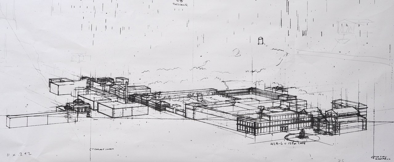
The buildings become quite small by doing this and detail will be a casualty but perhaps it could work for a portion of the painting rather than the whole composition. I think apart from loss of detail, there is a certain detachment in an aerial view as it is not how we normally see things. If it represented one aspect of his work – the urban planning of Munich – and other aspects were represented more closely in the foreground, it could work.
Roughly sketching out the idea, it seems to have a lot of potential; an overview of urban design and a closer inspection of the architecture.
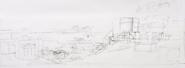
I could include a some of Ludwigstrasse in the middleground so that the detailing of the buildings would be more evident as this is also a crucial aspect of Klenze’s design. The buildings are treated as distinct from one another but related, a point Colin Rowe makes when he remarks, “the city as museum is distinguishable .. by its multi-formity” and refers to “the city of precisely presented discrete objects”. The variations of detail that give the buildings individuality but in a common vocabulary is something that captivated my wife, Christine, in Munich, and she spent hours studying the west side of Ludwigstrasse in the first block north of Odeonsplatz to understand what linked and what distinguished the individual buildings, the rhythms of detail that danced up the street like a musical composition. I will try to include that line of buildings in the middleground so this detail can be appreciated.
Conversely, it would be possible to include in the distant landscape, created by looking down on Ludwigstrasse, some of the larger projects which would be best seen from a distance such as Klenze’s design for a royal palace in Athens. If shown at the same proximity as Ludwigstrasse it would dominate the composition and is not designed to the same level of detail so is perhaps better seen from a distance. It can sit in the landscape much as it was intended to sit in relation to the acropolis. In fact, it might be appropriate to include the Acropolis as a reference to Klenze’s interest in archaeology and as specific inspiration for Walhalle.
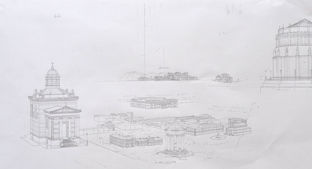
The idea of an open plain stretching into the distance gives the opportunity for incorporating other large scale structures like Klenze’s work on the Ludwigskanal and his bridges. Thinking back to paintings I did for John Outram and to the idea that Claudian landscapes are traditionally entered via a bridge over a stream, it might be a nice variation to include a stream going over a bridge in this case, as Klenze did with the Ludwigskanal. I also like the idea of Including the Stourdza Chapel, Klenze’s last completed building, in the foreground. Appropriately, it does sit on high ground overlooking Baden-Baden.
In researching Klenze’s drawings housed at the Bavarian State Library, I have stumbled on my title for this painting as his works there are all collected under the title Klenzeana.
Klenzeana 22.9.15
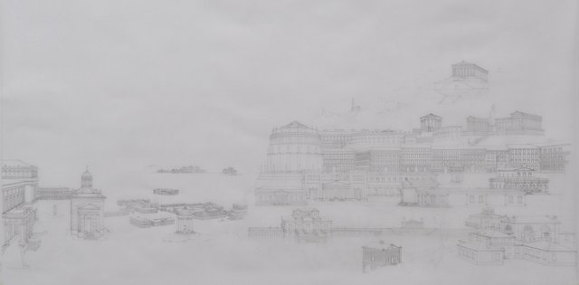
Big moment – I think the composition is more our less settled after two and a half months of drawing. What a good way to greet the autumnal equinox – transferring the drawing onto canvas and starting painting. I am definitely suffering withdrawal from not painting for that length of time. My son helped me to hang all the paintings cluttering up the studio on the weekend, so that it is as clear as it can be to start the new work. There are a few changes still to be made, but that can happen in the transfer onto canvas.
I want to raise the distant buildings on the horizon slightly and add a few buildings in the middle distance and the Ludwigskanal viaduct.
As the New Hermitage has appeared on the far right foreground, it can disappear from the middle ground where it was not very well integrated. The new position is much better as the atlantes, the male sculptural columns in the entry loggia, will be more visible. In the landscape beyond I want to incorporate the painting Klenze made of the Atlant in Agrigento, as a reference to both his painting and his archaeological work. I have put two of his early hypothetical villa designs in the foreground so that the foreground contains his earliest work and his last, the Stourdza Chapel.
I have included the Erzgiesserei in the extreme right foreground. This is the Royal Foundry Klenze designed which was used to cast the bronze statue of Bavaria in front of the Ruhmeshalle as well as a number of other statues around Munich. Bavaria was the largest casting at that time (1850) since antiquity, and the Erzgiesserei continued to operate until the 1930’s. We spent a great deal of time trying to find the foundry buildings when we were in Munich, but they had been demolished. However, I found enough information in etchings and old photographs to reconstruct the buildings, and intend to include the surreal image of Bavaria’s gigantic head being wheeled across the Erzgiesserei courtyard from an 1850’s photograph.
25.9.15
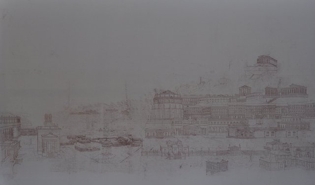
The drawing is transferred onto the canvas, canvas stretched and I am ready to start painting.
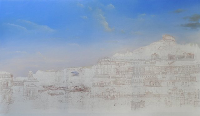
The first decision is the direction of the light. Traditionally it is from the left so that a painter in front of a landscape is not painting or drawing in the shadow of his or her hand – assuming they are right handed. I think this also works with the way we read in Europe from left to right, taking you into the picture. However, in this case, I think the light would be better coming from the right, over the right shoulder theoretically. There are more buildings that will be strongly defined with one facade lit and the other in shadow. The idea of one facade in sunlight and the other in shadow gives the building more of a sense of volume. I have noticed that Canaletto often has two different light sources in his paintings allowing all of the buildings to have one facade in light and the other in shadow, so that looking down a canal with buildings on either side one side is lit and the other in shadow, which makes sense, but the facades facing the viewer, in the plane of the picture, are lit on one side of the canal and in shadow on the other side so that they contrast with the facades on the canal. It is almost a cubist sensation with a passage of time between looking at one side of the canvas or canal and then the other side. Too fanciful I suspect.
With the light coming from the right, the facade of the Hermitage on the extreme left will be lit rather than in shadow which I prefer.
I don’t know if it was just expectation on my part, but I felt, in Munich, that the skies were very much as Klenze depicted them in his paintings. Something about the atmosphere? I shall try to catch that same atmosphere that Klenze painted so accurately in his Propylaen painting.
Later that day:
28.9.15
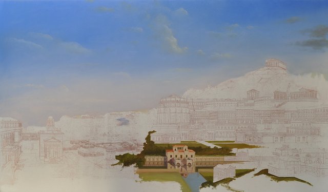
5.10.15
I am now looking at the topography that seemed fine in a drawing but proves more of a problem in paint as it is that little bit closer to reality. The position of buildings in the distance and the steepness of some of the hillsides need work to be believable but it seems these can be resolved. Things are just quickly sketched in at the moment to test whether the landscape and the composition work.
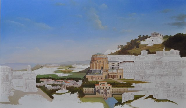
Klenzeana 8.10.2015:
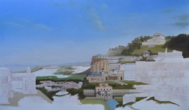
I am not happy with the perspective of the Hermitage and the Stourdza Chapel in Baden Baden in the left foreground. I moved the Hermitage from the distance to the foreground to give it more prominence and I liked the pairing with the Orthodox Stourdza Chapel as a concept. The localized perspective between the two buildings seemed to work nicely, but when seen on the canvas in the larger context, it does not relate to what is going on elsewhere and where the viewer is theoretically standing. I had originally placed the chapel so that it seemed to radiate out from a central viewpoint rather than a central vanishing point. In my mind that relates in some way to David Hockney’s obsession with perspective generated by the viewpoint rather than the vanishing point, and I think it can give a more expansive sense of space. It is not the same idea as in my case it is not perspective radiating from a viewpoint, but rather the placing of buildings so that they relate to a central viewpoint. The actual perspective of the buildings is traditional. I will try to reorganize this area as I had originally thought of it. At the same time, perhaps I can increase the scale of the Stourdza Chapel as the “centre of gravity” of the canvas seems a little low. If I can push the buildings up a little on the left hand side, I think it would be an improvement.
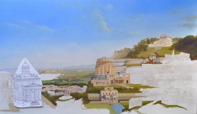
It is definitely better with the chapel larger and turned toward the viewer, but the relationship to the Hermitage does not work. I could move it somewhere else, but I like the connection between the two buildings.
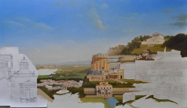
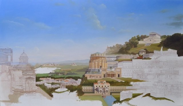
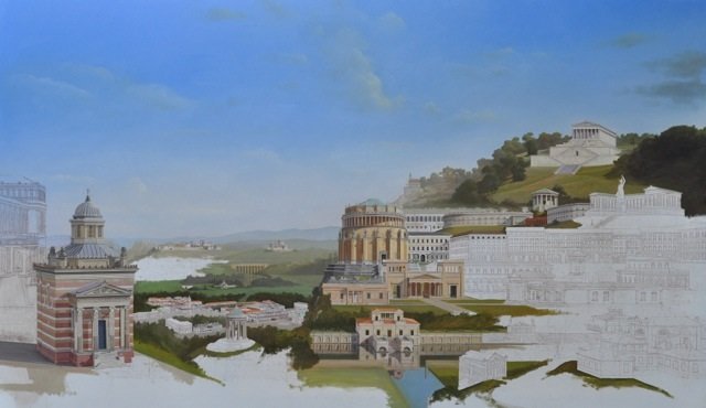
Raising the Hermitage above the chapel works and further resolves the low “centre of gravity” problem. It adds some movement to that corner of the canvas which was a little static before this.
The new positions of the Hermitage and the Stourdza Chapel are drawn onto the canvas. I think it is a big improvement.
13.10.2015
19.10.2015
20.10.15
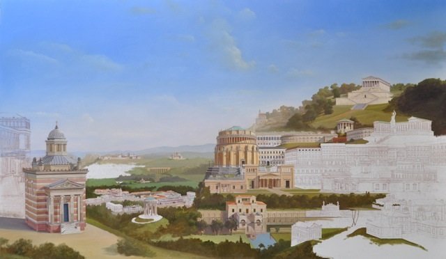
The chapel has much more of a presence now, and the overall balance of the painting is better. I can celebrate and allow myself to paint in a little more landscape.
23.10.15
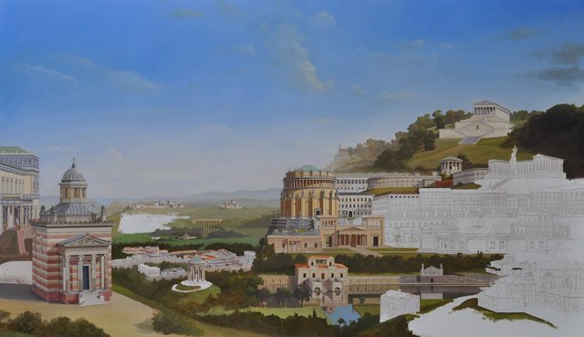
I revisited the Befreiungshalle, the circular building in the centre of the painting. The perspective was disturbing so I have gone over it again, flattening out the perspective. I think it is a great improvement. Circular buildings are the most difficult to get right in terms of perspective, I find.
11.11.2015
Having worked on the small scale aerial view over Munich in the middle ground, and reassured myself that it will work as an idea, having those buildings so small, I decided to make a start on the neglected right hand foreground corner of the canvas. The first thought was to enlarge the Attendant’s House from Walhalla. It seemed out of scale with the nearby buildings and is much better slightly (30%) larger.
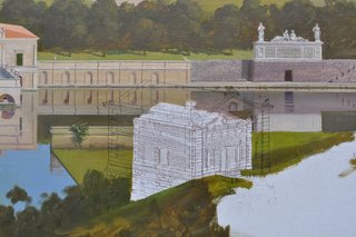
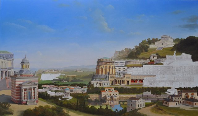
The Erzgiesserei, the foundry where the monumental sculpture of Bavaria was cast, was the next building or set of buildings considered. No longer existing, the information on it is sketchy. There is one photograph that is unclear about the materials and several engravings that suggest it was most likely brickwork. A painting of 1847 also suggests it could be brickwork or possibly roughly hewn stone. I sent the text relating to the Erzgiesserei to my German speaking friend Erik Winterkorn who found a passage in a letter from von Klenze stating the brickwork should not be rendered. It wasn’t clear if that meant internally or externally, but as the photo and engavings clearly show externally a coursed masonry, I think I can assume it was brickwork, especially as so many of von Klenze’s buildings in Munich are brick, rendered to appear as stone. The existing painting suggests a brick the colour of the brickwork in the Glyptotech (originally plastered) and the Pinakothek. It all seems appropriate to a foundry.
Next, I was happily painting the Propylaen, set up from von Klenze’s plan, when I noticed there was a problem in the relationship between the columns, shown regularly in von Klenze’s plan, and the regular setting out of the triglyphs in the frieze above them. My photos of the Propylaen show the main end columns of the portico are pulled in slightly from being centred on the triglyph above, allowing the triglyph to end the frieze. This means the end column bay is smaller than the next one. I don’t know how I missed that in drawing it up. It gives a powerful movement to the portico; small end bays, the next bay marginally larger and the central bay larger still with an additional triglyph and metope (the larger central bay was shown in von Klenze’s plan). The smaller end bay so the frieze ends on a triglyph is the arrangement on the Parthenon. I think Palladio, on the other hand, would have kept the columns at a regular spacing and ended the frieze with a sliver of metope so that the last triglyph was centred on the last column. It all sounds rather specialised and technical, but it does make the portico much more dynamic than a regular spacing would do. It is probably originally motivated by the wish to make the central bay larger to accommodate a carriage passing through it, and rather than just make the central bay larger why not bring all the columns into a movement building towards the centre.
23.11.2015
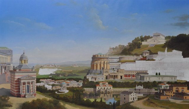
I have added the Glyptothek and a hypothetical villa design opposite the Erzgiesserei on the canal. I am still not happy with the Stourdza Chapel. Something seems wrong about the roof, so I set it up again from scratch as a drawing and overlay the drawing on the painting. The body of the chapel is okay but the roof and cupola are too large and the centre of the cupola needs to shift slightly to the left. The fact that the whole roof structure is too large stems, I think, from a change in the design between two von Klenze drawings I have been using as references. In one drawing, the width of the chapel is equal to the height from the cornice to the ground. In the other, the width is equal to the height from the cornice to the top of the plinth of the portico. Using the first drawing to set up the roof has resulted in it being too large. Scratch the roof out and try again.
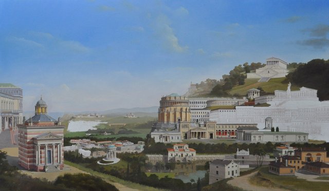
I think that is correct at last. The change unfortunately necessitates repainting the sky but that was necessary anyway as there were some patches that had not dried uniformly.
5.12.2015:
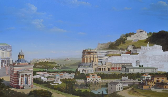
I now find the right hand end of the canal in the foreground is not working as I had hoped. I decide to use a different villa design and to add a little grotto design by von Klenze to the right of the canal monument to balance the villa garden wall to the monuments left. The villa I had in this location was somewhat lost behind the Erzgiesserrei and was not adding anything to the composition.
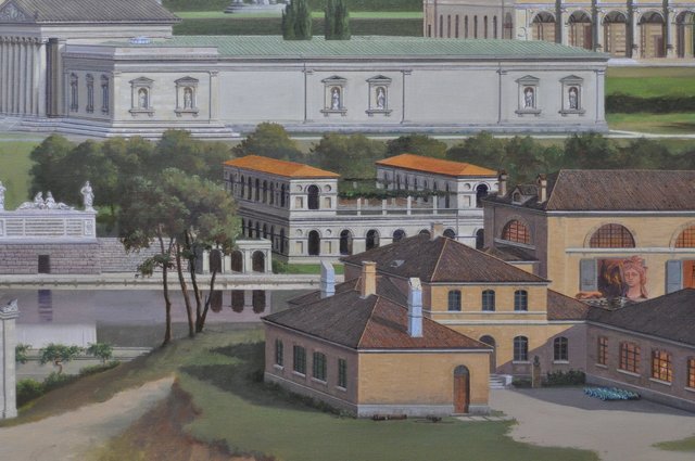
20.12.2015
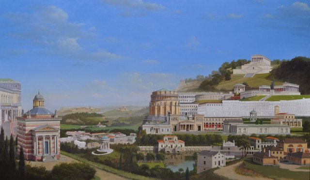
I think this is much better, and I have taken advantage of the changes to raise the pitch on the Erzgiesserei roofs which looked a little flat.
23.1.16
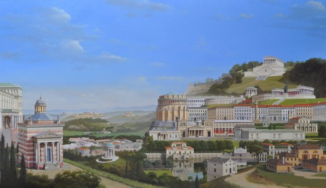
I have continued adding buildings, most importantly the Hermitage in St Petersburg on the extreme left which needed a little adjustment to its perspective from the drawing I had put on the canvas. Also, I have added the section of Ludwigstrasse that appears to the right of the circular Befreiungshalle in the centre of the painting. That fills in the last major portion of white canvas remaining. I decided to break up this run of buildings on Ludwigstrasse with the Konstitutionssaule, a monument commemorating the Bavarian Constitution in the form of a Doric column. I initially thought this a straight forward Doric design until I looked more closely at the capital.
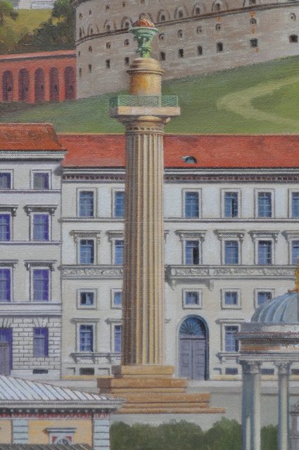
Where there might be grooves in the column at the necking where the shaft meets the capital, there is a projecting moulding here, a kind of astragal that I have never seen on a Doric column before, and the flutes on the shaft pass behind it to reappear above.
29.1.2016
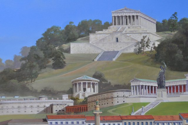
In working on Walhalla, I noticed the same detail that caused me problems on the Propylaen, where the end column is not centred on the triglyph above, but pulled in slightly so that the triglyphs and metopes are equally spaced but the columns are not. In trying to find precedents for the interesting capital on the Konsitutionssaule, I came across a description of this situation where the column is not centrally placed under the triglyph and discovered it is known as the Doric Conflict. I also learned that the solution of the half metope on the corner, which is how I said Palladio would have resolved the dilemma, was an invention of Vitruvius. I suppose I should have known about these things – one of the shortcomings of a modernist architectural training. On the other hand it is quite nice to have discovered this dilemma by looking at architecture and noticing the problem rather than being taught about it. There is an element of discovery this way.
26.1.2016
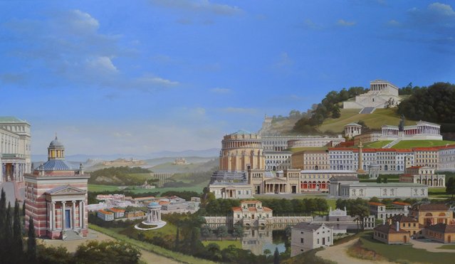
I am not happy with the way the Ludwig-Ferdinand Palais and Neue Schloss, Pappenheim are side by side and decide to move them apart. I don’t know why I put them like they were. I put Papenheim in this position as I actually saw it like this from the castle on the hill above Pappenheim. I then thought this was also a good spot for the Ludwig-Ferdinand Palais as it is just above where it should exist in the plan of Munich below but where I chose to use Klenze’s design for a square, domed church instead. Klenze showed this church in a number of design drawings and a perspective and I felt it would be interesting to see it here. That accounts for locating the two palaces roughly where they were but I do not know why I put them so close together. I decided to repaint the Ludwig-Ferdinand Palais a little further to the left, leaving a bit of space between them.
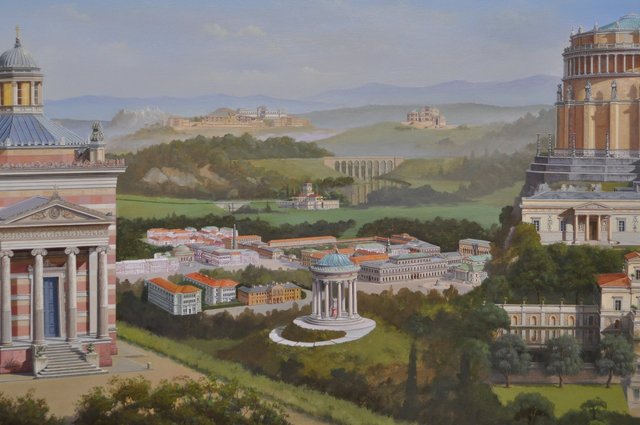
29.1.2016
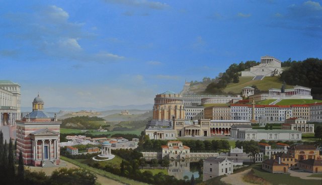
Back to Ludwigstrasse to add detail to the buildings and deepen the shadows in some areas like the Hauptpost arcade giving it more depth. The Hermitage is finished and I am pleased with its new higher position. The little glimpse of the Alte Pinakothek to the right of the circular Befreiungshalle has been painted. I think I might find a similar position for the Festsaalbau where just a portion of its great length can be glimpsed, perhaps to the right of the Ruhmeshalle – the building with the large bronze statue of Bavaria in front of it. The Festsaalbau has been criticised as being too long and a bit boring, but I actually quite like it. It is almost more than a building, a piece of urban fabric. Each side engages with a different part of the city centre. The main facade forms a wall to the Hofgarten, the large park just off Ludwigstrasse. End elevations front on the Marstallplatz and the Odeonsplatz while its south elevation forms internal courtyards in the Residenz. For a very regular symmetrical building to fit into such a variety of situations is quite a feat. I also think the loggia to the Hofgarten, based on Palladio’s Basilica in Vicenza is rather stunning.
6.2.16
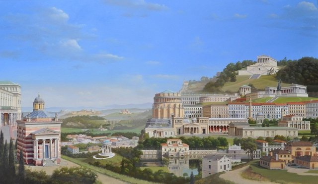
I am increasingly bothered by the absence of the Festsaalbau, the long frontage Klenze added to the old palace, the Residenz, facing onto the Hofgarten. It only appears as a roofline in the high level view over that area of Munich I have incorporated in the middle distance. I do like that building very much and would like it to be more prominent. I think it is possibly a mistake to have the Erzgiesserei, a very utilitarian building, in such an important position in the right foreground and the Festsaalbau hardly present at all.
Erzgiesserei:
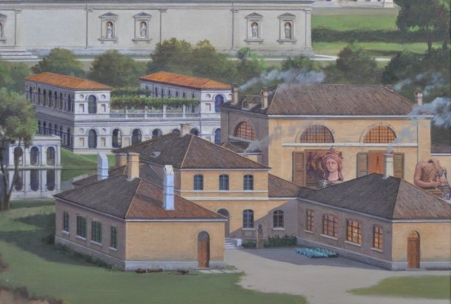
In my old formula for a classical landscape handed down to me by John Outram this is, in fact, correct. It is part of the formula to proceed from the more humble, rural areas into the painting, getting ever more refined architecturally until arriving at the temples at the apex of the journey. Other rationals for retaining the Erzgiesserei in the foreground are the surreal interest of the enormous head of the Bavaria statue shown in the courtyard and the fact that it is a speculative reconstruction of a building long since demolished which I think makes it quite interesting. But I keep coming back to thinking it would be more appropriate to have the Festsaalbau in this important spot.
I am also slightly annoyed by the Walhalla caretaker’s house to the left of the Erzgiesserei at an angle that is uncomfortable in relation to the villa on the water beyond it. I think that kind of casual meandering relationship is not really what von Klenze was about in his architecture. Perhaps in his painting that kind of relationship is quite common, especially in his paintings of the Italian and Greek countrysides, but in his own architecture and planning there is a more rigorous geometry at work.
Taking out the caretaker’s house improves the composition I feel, but what to do about the the choice between the Erzgiesserei and the Festsaalbau. I think the only way to resolve it is to draw the Festsaalbau as it could appear in that position and try it out. The Erzgiesserei could move to the distant plain beyond the view of Munich where it could be expanded to show more of the buildings that were located on the site, including an interesting timber tower whose purpose is not clear to me. It would also be possible to show the procession with the head of Bavaria being wheeled along to join the rest of her body at the Ruhmeshalle, which has been captured in an old photograph and an etching.
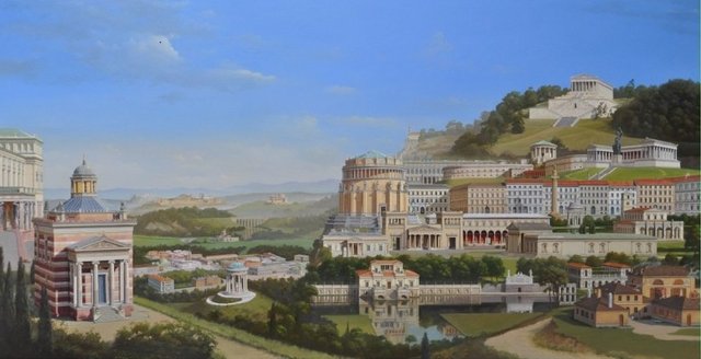
I could put the Festsaalbau up on the hill between the Ruhmeshalle and Walhalla but I think those temples should have the hills to themselves and not be crowded by urban buildings.
8.2.2016:
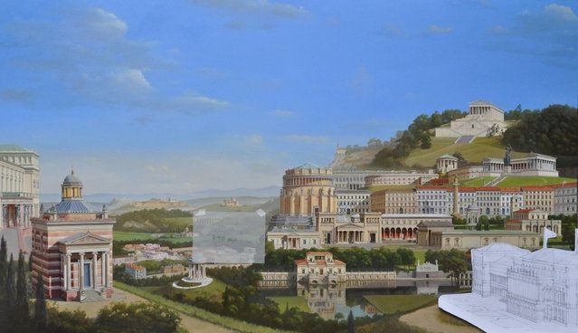
I think this works and is worth doing. I can give some sense of the Festsaalbau’s Hofgarten setting by incorporating some of the planting which can make a transition or link between the Festsaalbau and the villa on the water. I think this leads the viewer into the painting better than the Erzgiesserei did. On the down side, the Erzgiesserei will be quite small but I think the idea of the procession with Bavaria’s head may make up for that.
9.2.16
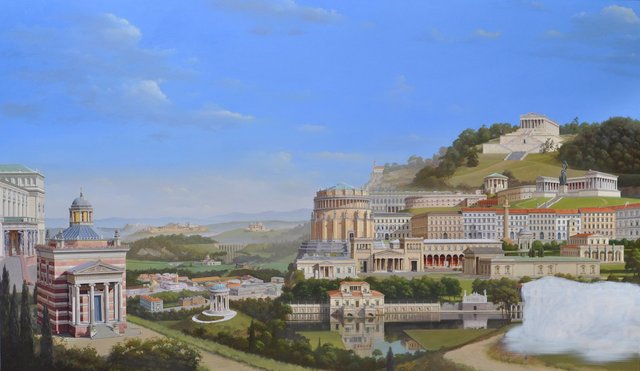
No going back now! At least not without having to totally repaint the Erzgiesserei. I have sanded down the Erzgiesserei so that it does not appear in relief under the new painting and given the area where it was a thin coat of white paint on which I can draw the Festsaalbau.
10.2.16
10.2.16
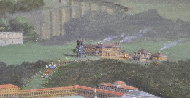
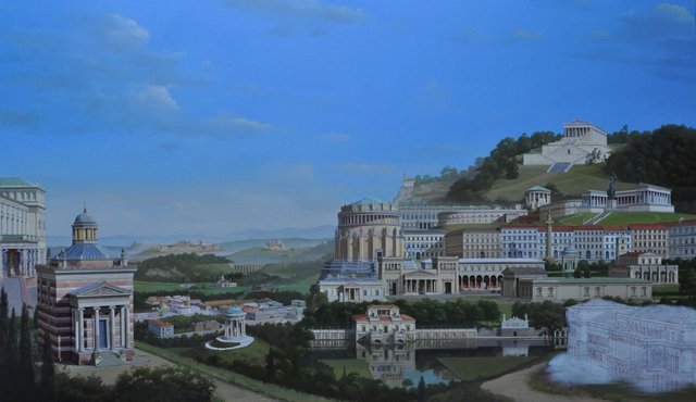
An extended version of the Erzgiesserei is added in the distant plain beyond the city with the head of the Bavaria statue being pulled in procession to the city and her torso standing in the space between the two main buildings. Both pieces in bright yellow bronze having not yet developed their familiar dark patina. They are shown like this in contemporary paintings, freshly cast and and a bright orange with touches of magenta. The same is true of the obelisk in Karolinenplatz which I have moved to the Odeonsplatz where it is shown in an early von Klenze design in front of a centralized church.
The new position of the Festsaalbau, meanwhile, I feel is absolutely right, leading one into the painting. A little piece of the formal Hofgarten in front of the Festsaalbau works well with the Villa on the Water design.
15.2.2016:
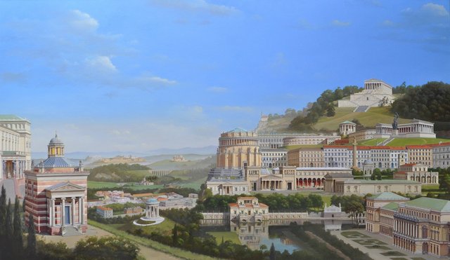
20.2.2016:
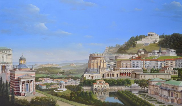
I have made the tree lined avenue of the Hofgarten more dense and repeated it on the left side of the canal leading to the villa, but actually do not like it denser like this and looking back at the previous photo, prefer it that way, but including it on both sides of the canal.
20.2.16:
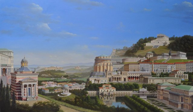
Two things strike me as interesting about this. The first is that these are just intuitive decisions, trying to create an image of a place that is convincing where there is not a model on which to base the image or any definite rules governing how to proceed. The other interesting point is that this record of the painting’s progress is actually proving useful in making decisions between approaches. I can refer back to earlier stages and compare the effect of different decisions like the density of the trees. Sometimes something seems better simply because it is different from what was there previously. To be able to compare a change with an earlier image allows for a more considered view of the relative merits even though the decision might still be mainly intuitive.
4.3.16
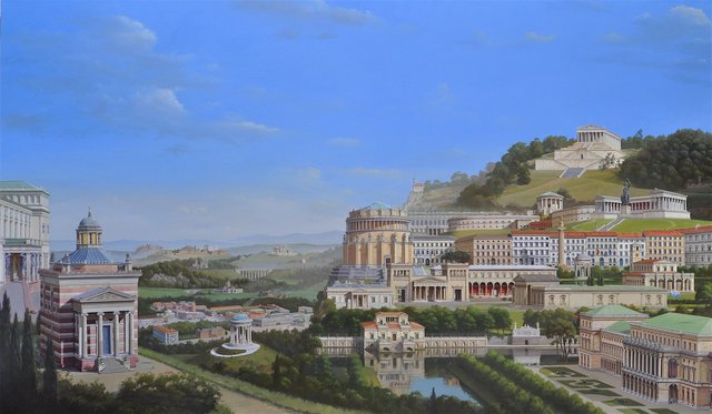
Replacing the Erzgiesserei with the Festsaalbau was absolutely the right thing to do, I am relieved to say. I have gone over the section of the Ludwigstrasse to the right of the Befreiungshalle which seemed a little flat and diagrammatic. I have done a few more buildings in the distance and in the view over Munich which is working out much better than I thought it would. Although the buildings are comparatively small, they give a good feeling of their relationships to each other and a good sense of how extensive von Klenze’s work in Munich was.
21.3.16
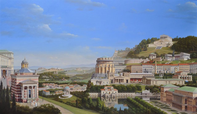
Klenzeana may be finished on the Vernal Equinox! I am not certain but will live with it for awhile and see if anything jumps out at me as needing more work. I have been going over the painting; intensifying it, adding landscape and populating it (staffage!) relandscaping the Ruhmeshalle, adding a procession to the Stourdza Chapel.
Klenzeana 21.3.2016
Klenzeana 12.4.2016:
Klenzeana is now finished, a little later than the Vernal Equinox.
I have repainted the boulevard of trees in front of the Festsaalbau, adjusting the perspective slightly. I have also altered the trees in front of the Ballhaus in Kassel (between the Befreiungshalle and the Villa on Water) so that it its position on the cliff edge is visible and suggesting also a connection through the trees to the villa in front of it. I have altered the colour on the Ballhaus and deepened the yellow at the base of the drum of the Befreiungshalle to distinguish it a little from the Propylaen in front of it. Nothing more to do – oh yes, I signed it.
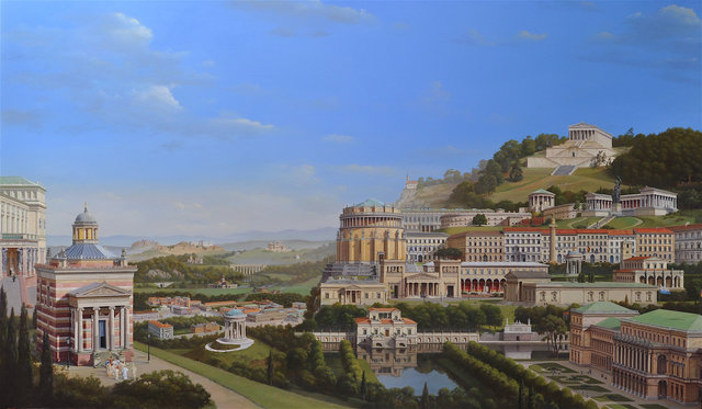
Most final Klenzeana, 15 April 2016
