The next project I am embarking on is one of John Nash’s buildings. I have had a book on Nash, edited by Geoffrey Tyack, for some time. It has been sitting on my desk with the beautiful photo of Cronkhill on the cover staring at me. It seemed like a good idea to follow my Leo von Klenze paintings with something closer to home.
I decided to make him my next subject rather as I did with Lutyens, without thoroughly considering what it would entail. Now, as I start drawing up Nash’s buildings, I notice there are 287 entries in Michael Mansbridge’s Complete Catalogue, many of which include multiple buildings such as Regent’s Street for instance which includes dozens of buildings under one heading. I think Nash might be even more prolific than Lutyens.
The other aspect that is challenging is much of his work needs to be seen in context, of say for instance Regent’s Park, not as isolated buildings taken out of context. Nash was himself aware of the problem of depicting his work in context as he produced two panoramas of his buildings lining Regent’s Park, four inches high and twelve feet long – each. The extreme length of his terraces on Regent’s Park and the continuous line of development from the Park to Buckingham Palace raise serious compositional problems that as yet do not have obvious solutions. I think I must have a way of incorporating the map of the West End showing the extent of this development and the boldness of it, which would probably not be possible as a straightforward view.
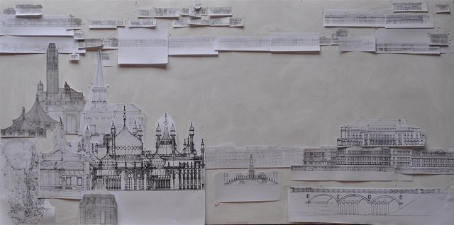
The first step, to familiarise myself with the work is to see as much as I can, and draw it up to scale as well as reading as much as I can find about him. I have started this and started sticking up the drawings at the same scale in relation to each other. The first shock is the length of the terraces. At the same 1:200 scale I used for Lutyens, some of Nash’s terraces would go half way across the painting, making it impossible to show in relation to each other. So I think I will have to reduce the scale, but do not want to create a composition of “postage stamps”, little images that do not convey the detail of the buildings. Having a long panorama in the distance at a small scale and foreground buildings at a larger scale would be a possible approach.
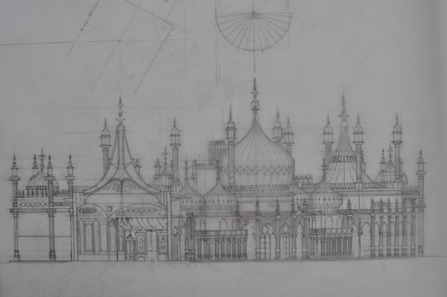
Meanwhile, visiting Brighton, I saw some wonderful detail drawings of the tent roofs on the Pavilion and was sent copies by the curator. They are truly wonderful drawings and I must find a way to incorporate them. Perhaps used as a drawing they could combine with a drawn map of the West End, giving a two dimensional portion of the painting that could intensify the three dimensionally rendered portion.
I am greatly encouraged to find that Ian Nairn dedicated Nairn’s London “To John Nash, who provided much of the material, and to Tony Godwin, who gave me the chance to write about it.”
Perhaps there is a patron out there who will give me the chance to paint this! It is going to be a long project with a lot of travelling. To have it commissioned would make it much more possible.
Royal Pavilion with section through tent roofed Banqueting Room:
Collaged drawings:
As I slowly put together the drawings of Nash’’s buildings, I decided to do some smaller paintings of related individual buildings. They not only add to the possibility of a larger exhibition on Nash, give me greater familiarity with his work before starting on the large capriccio, but also keep me in “training” for painting. A prolonged break from painting while I draw up the Nash buildings would leave me out of condition as a painter when it came to tackling the large work. Painting is like practicing an instrument or a sport, and it is easy to become rusty.
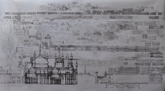
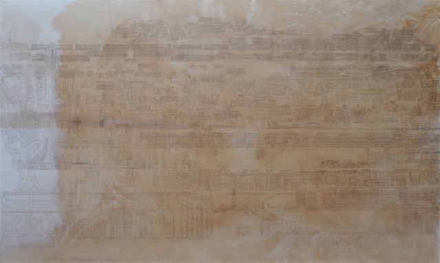
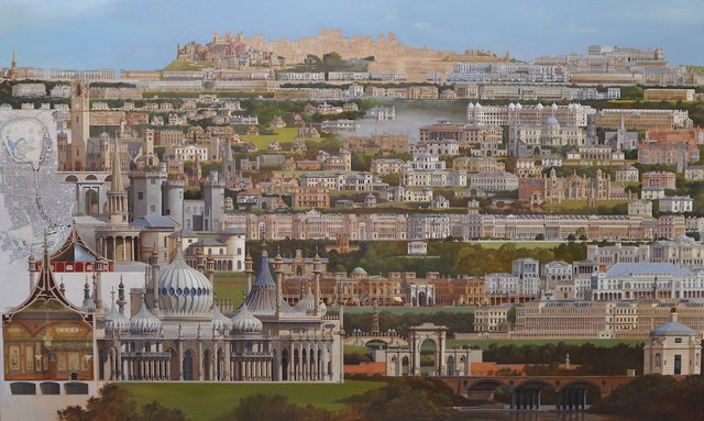
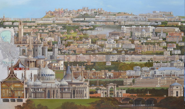
On the 15th of August I completed the individual drawings of John Nash’s buildings and the composition that would incorporate them. I then spent two weeks transferring the drawing onto the canvas and have now begun painting. The composition incorporates approximately 260 different buildings and projects.
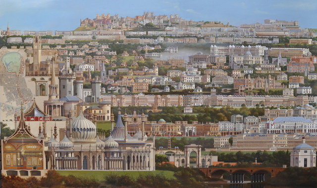
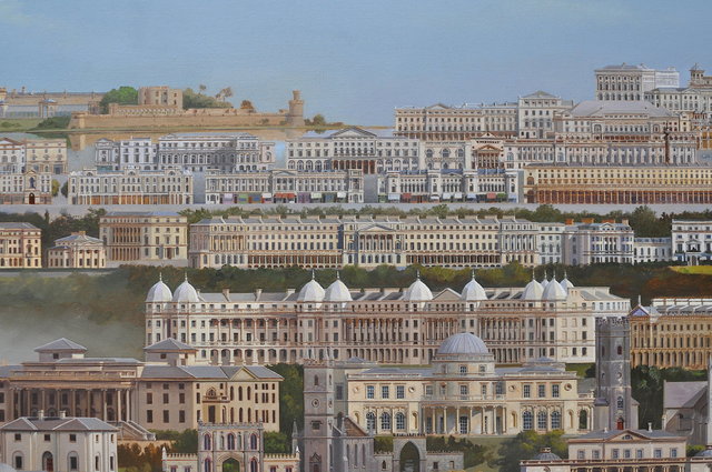
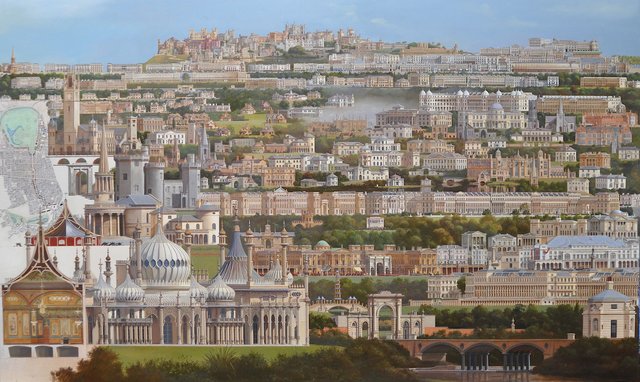
In combining these 260 buildings into a composition, two perhaps contradictory factors were important. The extent of what Nash constructed both in the terraces surrounding Regent’s Park and the buildings along Regent’s Street itself, and the desire to see the architecture close up in detail. As a solution, I have shown the full extent of Regent’s Street from Langham Place to Piccadilly Circus and then from Piccadilly Circus to The Mall in two rows at small enough scale to fit across the whole width of the composition at the top. This presents a rather uncompromising straight horizon line which is somewhat at odds with Nash’s interest in the picturesque. Neither Regent’s Street nor the terraces around the park are designed as a single uncompromising line but in segments where one is drawn to a point of interest and then finds some form of re-orientating such as All Souls, Langham Place, The Quadrant adjacent Piccadilly Circus or the Circus itself; or individual buildings around Regent’s Park that break the line of the long terraces or spaces which punctuate the long lines of buildings. This works with presenting Regent’s Street in two lines, broken at Piccadilly Circus.
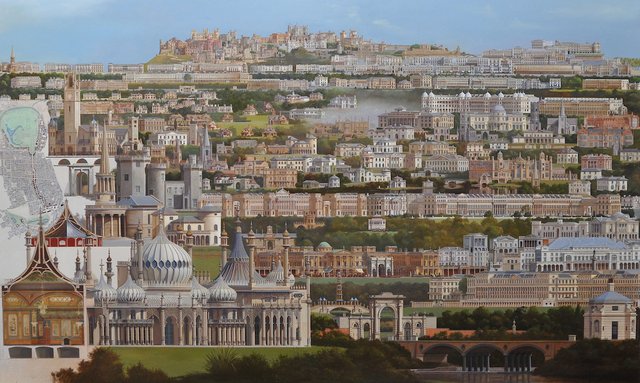
To deal with the straight horizon line, I decided to introduce Nash’s castle designs at the top, breaking the horizon line in a suitably picturesque arrangement of castles on a hilltop. In similar fashion, on the extreme right horizon I have wandered eastward from Waterloo Place off the line of Regent’s Street buildings to show Nash’s plan for Trafalgar Square, the Opera House, and his Strand buildings rising above the straight line of Lower Regent’s Street.
To further emphasise the extent of Nash’s work in London, I am including a map from 1837 showing Nash’s continuous development along the park and Regent’s Street. I think this will combine nicely with several buildings shown in section such as part of the Royal Pavilion at Brighton and the similar Woolwich Rotunda. I hope I can set up a dialogue here between flat two dimensional surfaces like the map and a very architectural drawing approach to drawing buildings in section with a more three dimensional feeling for the interior of the Banqueting Room in the Brighton Pavilion pressed into those flat areas or the exterior of other buildings pulled out from the flat surface.
Showing the extent of Regent’s Street across the full width of the canvas reduces the buildings to a scale where they are not especially interesting as buildings but more as a street scape. I have found a wonderful facsimile book by John Tallis called London Street Views. A survey of the existing buildings between 1838-40, it records Nash’s original buildings for Regent’s Street, all replaced now save All Souls Church.
To satisfy the wish to see the buildings at a larger scale, I will show the buildings below the Regent’s Street horizon line at a larger scale and then take individual examples of each type of building (church, Italianate villa, cottage orné, castle, bridge) and show them at an even larger scale tumbling downhill into the foreground from the upper left corner.
Composition drawing 15.8.2017:
Drawing on canvas 2.9.2017:
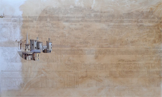
Nashdom 6.9.2017:
Nashdom 11.9.2017:
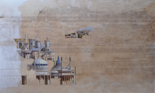
14.9.2017am
I have tried out all the different scales in the painting from the very small castles on the horizon to the largest, the Royal Pavilion and it all looks promising, but I hit the first spot in the composition I am not happy with and that is the gatehouse from Blaise Castle placed at the end of the Macclesfield Bridge from Regent’s Park. It does not seem appropriate and is also to straight on a view – it needs to be seen more from the side to relate to the bridge.
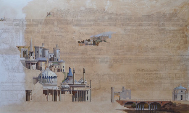
14.9.2017pm
I decided to change the gatehouse to the gateway at Attingham Park which is more the scale and seems stylistically in keeping with the bridge and Hanover Gate Lodge at the other end of the bridge. Fortuitous as well as I am going to visit Attingham Park and Cronkhill on the 17th. I think this works better and keeps the idea of entering the painting over a bridge and through a gateway which worked so well in Vanbrugh Fields, where it was through a gateway and over a bridge.
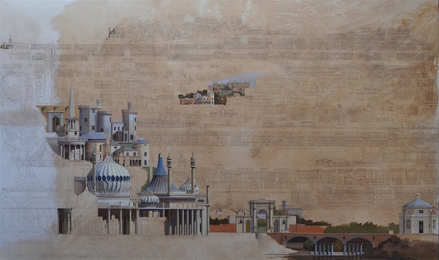
15.9.2017
Corsham Court which I visited in August is reconstructed in the painting to the right, halfway up, with Nash’s now demolished North Elevation along with the Bath House, Boat House and Dairy all of which still exist. The North elevation was demolished and rebuilt to designs by Thomas Bellamy in 1846. Although the East Elevation remains pretty much as Nash left it, I thought it more interesting to concentrate on and re-create his North Elevation from existing views all of which diverge from each other in detail. This is my best guess.
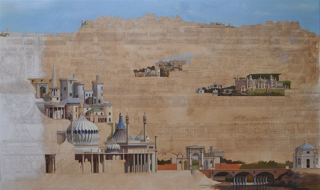
22.9.2017
Cronkhill was wonderful to see. I think it is my favourite Nash building with its Claudian tower and deep eaves sitting on the hillside over looking the Severn.. I had to be patient as the sun was in and out all day and I wanted to catch the effect of the newly rendered walls in full sunlight. The external walls have recently been stripped of their impermeable paint, re-renderd where necessary and painted with a breathable masonry paint that the NT believes is closer to the original colour. I also managed to catch the sun on the gateway to Attingham Park so that I could depict it convincingly in the foreground of the painting. The gallery and stair by Nash at Attingham Park were very interesting, the gallery lit by continuous rooflights in the coving of the ceiling. An innovative use of cast iron ribs to support the roof and glazing, it leaked for two hundred years. The change in the quality of light on a day like I visited with the sun dodging in and out of cloud was quite dramatic as there is little artificial light. Nash’s circular stair with fluted walls is also dramatic with its views down into the gallery and up to its glazed dome.
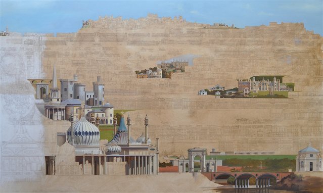
12.10.17
Making progress but the Royal Pavilion is slow work. It is such complex geometry and the collision of elements is difficult to get right. In stepping up the scale from drawing to painting I discovered I had made the central dome too large and had to repaint it. It is such a perfect building to have in the foreground because of its complexity.
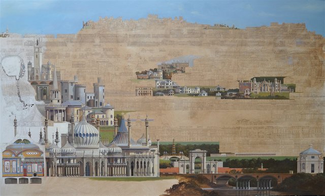
27.10.17
Slow progress on Nashdom. I am just about to start on Buckingham Palace and wondering what material the dome was sheathed in when it existed. I cannot find any references to this but did come across a @003 book by Sir Terry Farrell about redesigning Buckingham Palace which I just ordered. Perhaps there is something in that about the dome, but I am sure it will be interesting in any event.
Nashdom 27.10.2017:
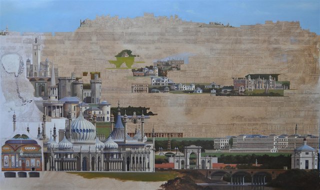
16.11.2017
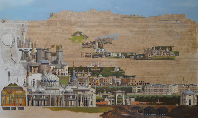
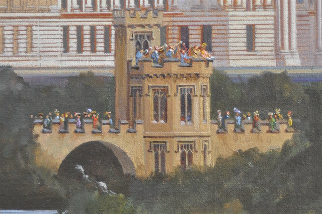
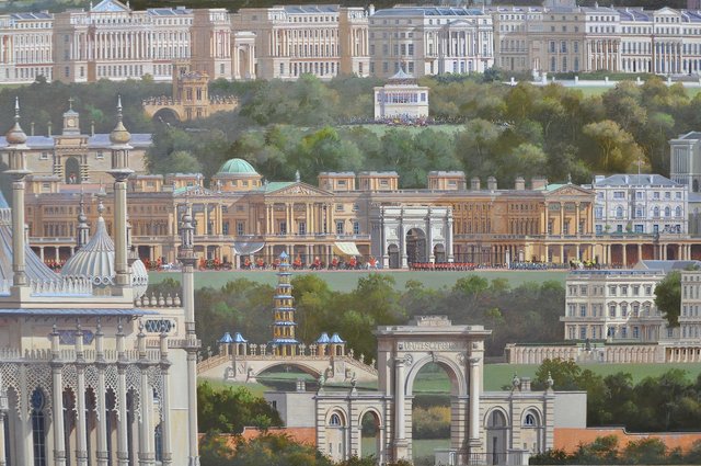
I finished Buckingham Palace with Marble Arch as it’s entrance and decided to populate it – staffage – with the changing of the guard. Staffage is a term I learned researching Leo von Klenze for my previous project!
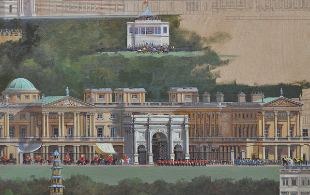
I went along to see the Canaletto exhibition at the Queen’s Gallery before it closes and made good use of the trip to London by watching the changing of the guard which lasted about an hour and a half. Wonderful splashes of colour to liven up the painting. I enjoyed painting that so much that I moved up the canvas and painted the two buildings I had always intended to be populated, Nash’s Royal Stand at Ascot and the Marina at St John’s, Ryde, Isle of Wight. Neither of these any longer exist and information is sparse and contradictory in the case of the Royal Stand and I could only find one drawing of the Marina. The description of it in Michael Mansbridge’s book on Nash, however, provides the motivation to depict it in use and populated with figures inspired by a Thomas Rowlandson print of Vauxhall Gardens: “ a towered and embattled marina…..from which to enjoy the sea views; it also formed a bandstand for concerts to entertain the promenading public on Sunday afternoons.”
I have also gone over many of the buildings previously painted to add depth and detail.
January 2018
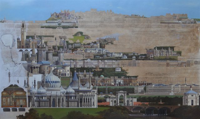
September 5th, 2019
My last contribution to the Nash project was January 2018, since when I have had an enforced sabbatical of twenty months as I oversaw some building work on our house and studio.
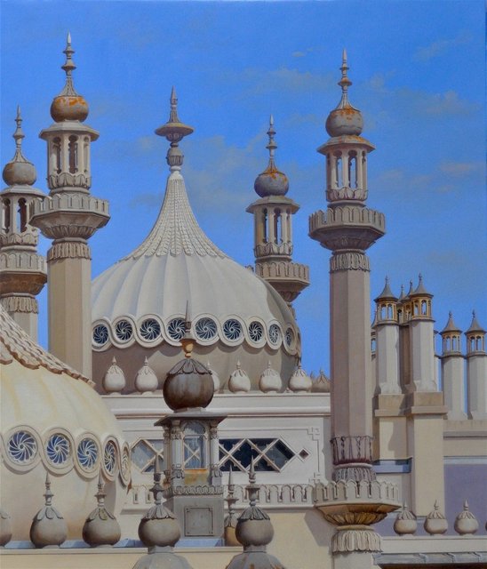
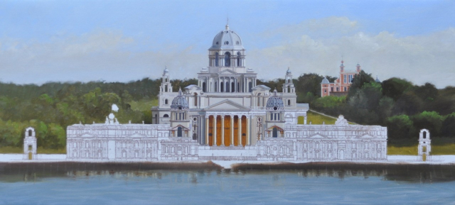
Now I am back at the Nash project and am reacquainting myself with painting. To get back into painting shape after such a long layoff and before tackling Nashville, I have done a number of smaller paintings. These consist of a series of roofscapes based on the Brighton Pavilion and a start on a new project I have in mind based on Hawksmoor’s unbuilt schemes to complete the Royal Naval Hospital at Greenwich. These paintings gave me confidence to start work again on Nashville which is now progressing up the right hand side of the painting. I think I must put the other work aside now and concentrate on Nashville as it is quite easy to lose my way if it does not have my full attention. I am excited by the Hawksmoor project but find that, with Nash, is too much. I spoke at length about the Hawksmoor idea in my Henry Hope Reed acceptance talk in Chicago in March, showing my preliminary drawings for it for the first time and found it was well received as an idea. Hopefully the idea will stay fresh while I carry on with Nashville.
Nashville:
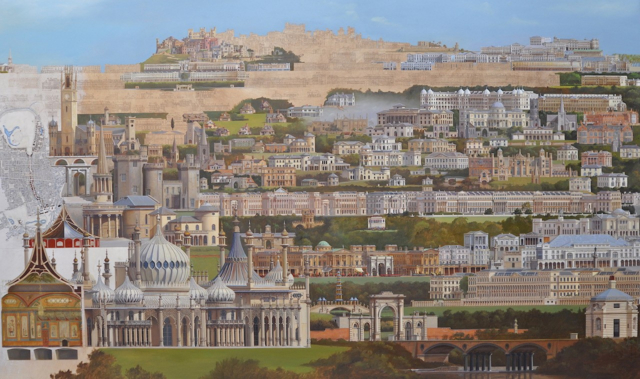
Brighton Pavilion Roofscape 1
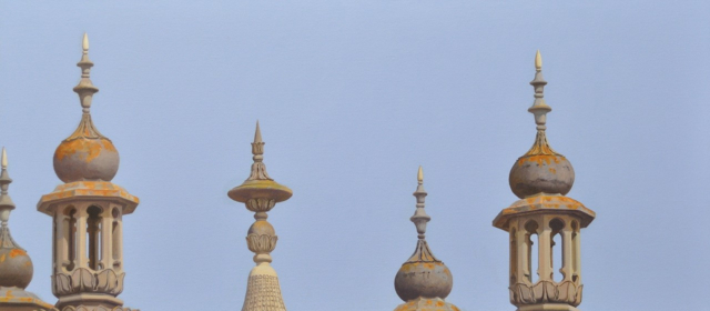
Brighton Pavilion Roofscape 2:
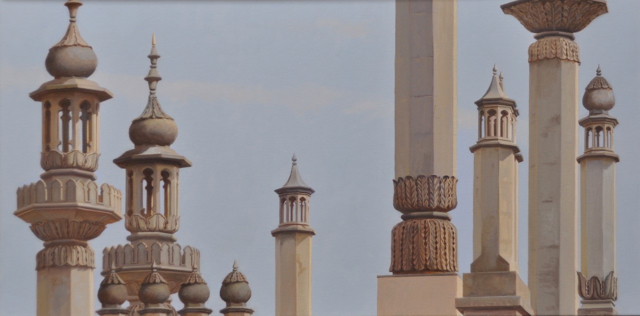
Xanadu, Brighton Roofscape:
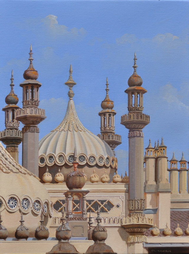
Nash’s Minarets:
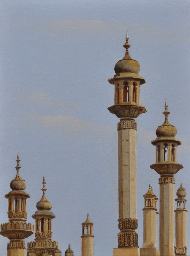
Hawksmoor’s “Second Scheme” for Greenwich
9th October 2019
Nashville seems to be progressing more quickly than I had expected and I seem to be back into the swing of painting again! Much better to be doing this than painting walls and ceilings. i need to get everything in place so that I can start going over it and tying it all together.
30 October 2019
A friend recently seeing my von Klenze paintings had this to say about how they might be presented which equally applies to “Nashville”:
I do think it is the case that the observer needs to know something about Von Klenze. The work is so refined and special and you have to have a bit of an ‘eye’ for it. Also, you have such interesting stories to tell about what you have included, such as the foundry for the giant statue and the parade of the head, etc. How one makes this available to a wider public is a question. Sometimes paintings have alongside them a photocopy on which are labels or descriptions as to what the various things are as a key or guide. The risk is that it is treated simply as a tour de force of technique which people respond to in a possibly negative way?
These observations do not take account of the information recorded on my website following the progress of the paintings and the rather lengthy text that was included in the Plus One exhibition, A Sentimental Journey, however, I agree that it is necessary to have some background information to allow one to enter into one of these paintings. A “tour de force of technique” is certainly not what I was about in painting any of these works which are much more a celebration of the various architect’s work. And I certainly don’t find these paintings easy to do, so I do not go along with the “tour de force of technique” assessment! In the case of all the architects whose work I have made capricci of, I have tended not to be aware at the start of the projects of the full extent of the architects’ work and conveying that full spectrum of their production has always been one of the main objectives of the paintings. Nash is a great example of this wide range of work where people might be aware of one aspect or another of his work but not of the full range. This was brought home to us when we visited Blaise Hamlet and spoke to one of the tenants there, who was completely unaware that the architect of her house was also the architect of Buckingham Palace! Nash the planner, Nash the designer of the grand terraces and Buckingham Palace, Nash the possible inventor of the suburb in Park Villages East and West, Nash the picturesque architect of Blaise Hamlet and numerous castles including his own on the Isle of Wight, Nash the theatre architect, Nash the country house architect, Nash the structural innovator …..
The aspects of Nash’s work that I was most unsure of incorporating successfully into Nashville were his urban designs, particularly Regent’s Street. I wanted to give a sense of the long runs of buildings originally lining Regent’s Street and included these running from Langham Place to Piccadilly Circus and then another run from Piccadilly Circus to the Mall. I presented these buildings as they appeared at the time of Nash, as continuous development in their actual relationships to each other, risking that they became quite small to fit them in across the canvas, but I think it actually works. The run of buildings from Langham Place to Piccadilly Circus occupies the full width of the canvas and then a second sequence from Piccadilly Circus to the Mall is shown above it. It is the continuity of the design that is interesting and other works can be brought forward for greater inspection, like All Souls, Langham Place. The long line of Regents Street is then contrasted with the more picturesque castles above which break up what would have been a rather flat skyline.
Everything is in place now and has been painted at least once. Now the process of pushing and pulling, sharpening and softening, darkening and lightening begins and continues until it feels “right”.
Detail of Park Crescent:
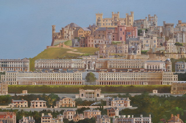
Detail of Sussex Place:
16th November 2019
Creeping towards completion! I keep finding large areas that have not been progressed since their initial painting and it does make such a difference to go over them again (and again). I also want to do more with the landscape, using it to take the viewer into the picture rather than just being a horizontal banding of greenery between bands of building. I have put some water winding its way into the painting to the left of Corsham Court about half way up the painting on the right hand side. This works well with a number of the buildings, especially the Boat House at Corsham Court and the bridge Nash built in Regents Park. It also makes the buildings more vertical as they are reflected in the water and that helps break down, or makes a counterpoint to, the horizontal banding that can become a little relentless.
25th November 2019
Little amounts of retouching go on.
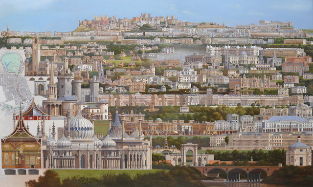
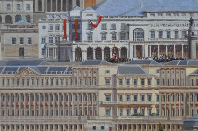
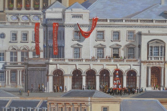
Aware that there was a large piece of Carlton Terrace to go over, I decided to look at that part of the canvas and stay away from the left side which was quite wet and I probably would have done more damage to than good. It suddenly occurred that it would be fun to put some references to my Royal Opera House paintings from 1987 into this earlier incarnation as the King’s Opera House by Nash. So I put the red banners from the earlier painting along with the crowds watching a human pyramid formed by acrobats. It adds a nice touch of colour. Nice continuity as well, as in the Lutyens capriccio I included red banners on his NT design that were similar to my old Opera House paintings. Now I must find something to put on the banner! Rossini’s Barber of Seville, Elisabetta, La Cenerentola and Tancredi were all premiered at the King’s Opera House in 1818-20, Google tells me. Perhaps La Cenerentola, Cinderella, would be appropriate. The red has to dry first which gives me a few days to think about it! None of these seems as relevant as the “Measure for Measure” that I used for Lutyens which referred to his motto, Metiendo Vivendum, “By Measure We Live.”
10th December 2019
La Cenerentola it is. Rossini seems to have really been on a roll at this time so it is an appropriate choice:
Buckingham Palace detail:
Nashville is complete! 1.1.2020
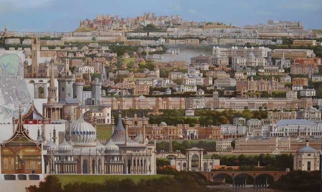
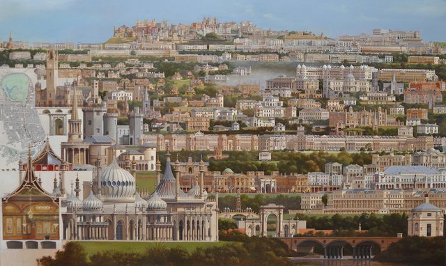
I have lightened slightly the foreground shrubbery and am not convinced it made any difference which is my somewhat negative way of knowing it is finished.
14.11.2020
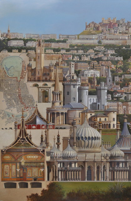
I have decided to revisit Nashville as it is still in my studio. I have put a warm glaze on the left hand side where the map of Regent Street is, which tones it in better with the rest of the painting, and have changed the Nash buildings from Regent’s Park to Buckingham Palace in that plan from dark sepia to red. This makes the route from Regent’s Park to Buckingham Palace read more strongly and carries on the red of the Woolwich Rotunda further into the painting. I think I might increase the amount of landscaping on this side of the painting as well.
